

The word was coined by Thomas Hine, a design critic and cultural historian, in his 1986 book of the same name. Hine blended “popular” and “luxury” to describe the design culture of the American 1950s: the tail fins, the starbursts, the chrome accents, the jewel tones, the particular kind of optimism that put the shape of a rocket on a mailbox and saw no contradiction. The word names something that had not been named before. Once you know it, you see it everywhere.
Populuxe is the design of the American postwar middle class at the moment of its greatest confidence. It is the moment when mass production had figured out how to make something genuinely aspirational and affordable at the same time, when a Chevrolet could have tail fins that looked like the future, and a kitchen could have the turquoise and coral and chrome of a cocktail lounge, and these were not considered absurdities. They were considered beautiful. The people who bought them were not wrong.
What Hine Was Describing
The cultural history of the 1950s has been written twice. The first version, written by the decade’s own participants, was triumphalist: postwar abundance, suburban expansion, the American standard of living as the proof that democracy worked. The second version, written from the 1960s onward by critics who found the first version embarrassing, was corrective: conformity, consumerism, anxiety underneath the prosperity, the era’s design evidence of its shallowness.
Hine’s book was a third version. He looked at the actual objects, the cars and appliances and furniture and kitchen goods of the era, and argued that the people who made them and the people who bought them were doing something more interesting than either the triumphalists or the critics acknowledged. They were taking the formal vocabulary of elite modernism, the clean line, the organic curve, the confident gesture, and democratizing it. Not by cheapening it, but by finding the version of it that mass production could make well and that ordinary people could afford and that looked, in a kitchen in Levittown or a driveway in Van Nuys, genuinely good.
The Starburst clock was not a museum piece. It was a clock you could buy for a reasonable amount of money and hang in a dining room, and it looked extraordinary on the wall, and this was the point. The design of the era was a genuine accomplishment, not a symptom.
The Shapes
The visual vocabulary of Populuxe is distinctive enough to be self-defining. You know it when you see it.
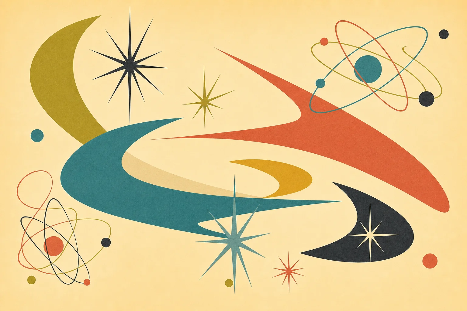
The starburst is the central form: a radiating pattern of lines or points from a central disk, appearing on clocks, on mirrors, on light fixtures, on ceramic tiles, on fabric patterns, on the fins and chrome ornaments of automobiles. The starburst is the atomic age made decorative, the visual suggestion of energy and expansion that runs through the culture of the era like a recurring chord. It is not coincidental that this shape became ubiquitous in the years immediately after the first photographs of atomic detonations were published. The shape is the period’s dominant metaphor given physical form.
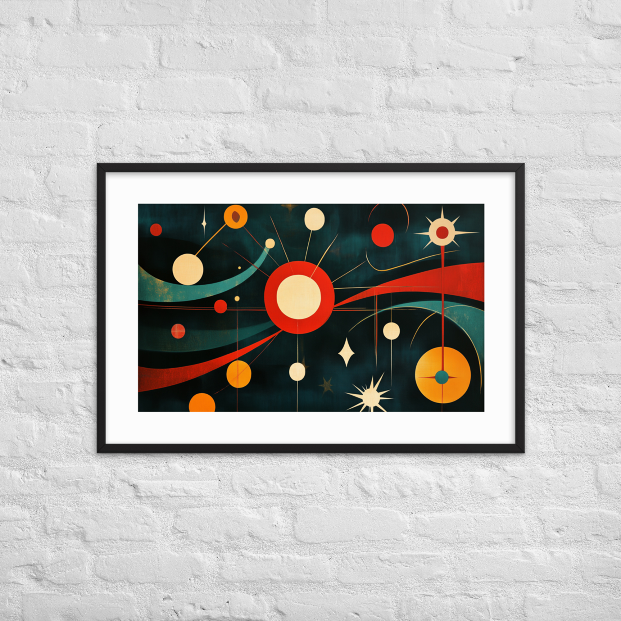
The boomerang is the other signature form: a curving, biomorphic shape with two unequal arms, appearing on coffee tables, on the cutouts of furniture legs, on the graphics of the era, on the patterns of Formica countertops. The boomerang is the organic gesture, the claim that mid-century design was not cold or mechanical but warm and human and related to natural forms, even when those forms were entirely invented.
Alongside these: the kidney shape (tables, pools, conversation pits), the atomic split (the electron-and-nucleus motif that appears on everything from wallpaper to promotional graphics), the bold horizontal stripe, the chevron, the pinwheel. The era had a shape vocabulary the way a language has a grammar, and once you know it you can read the period the way you read a sentence.
The Colors
The palette of Populuxe is not subtle. Harvest gold. Turquoise. Coral. Chartreuse. Avocado. These are the colors of the appliances and the cars and the fabrics and the ceramics of the 1950s, and they are exactly as vivid as they sound. The era was not interested in restraint in color. It was interested in specificity, in colors that announced themselves clearly and held their shape across materials and scales.
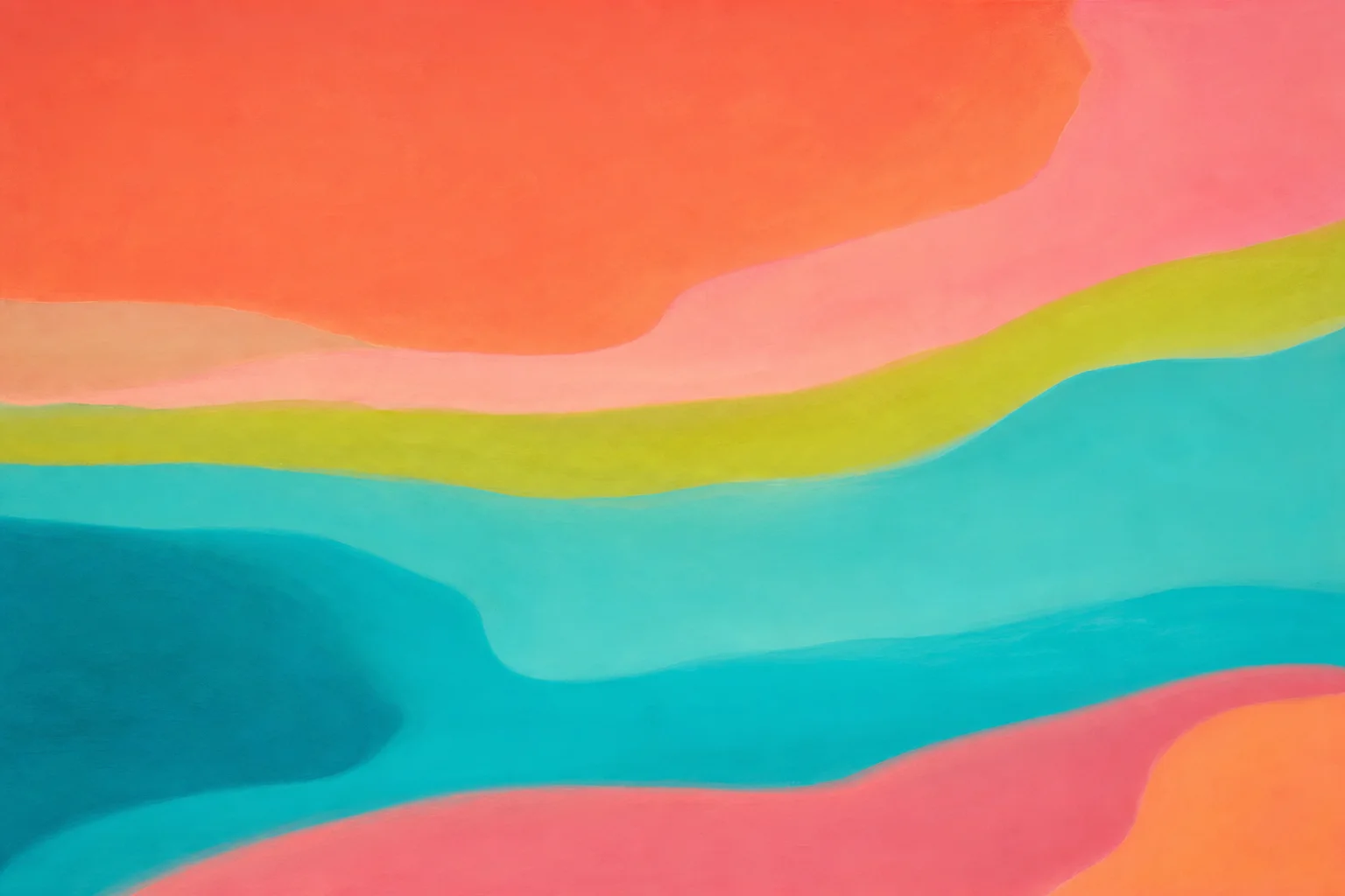
The jewel tone is the appropriate descriptor for the best of the era’s palette: saturated, warm, clear. Not pastel, which reads as tentative. Not primary, which reads as naive. The jewel tone reads as confident, and confidence is the right register for a decade that was, whatever its other qualities, genuinely confident about the future it was building.
The colors are also, as a practical matter, easy to integrate into contemporary rooms. A turquoise pillow against a neutral sofa does exactly what a turquoise appliance did in a 1958 kitchen: it announces the era without requiring everything else in the room to participate. The palette travels well because it was always meant to be deployed strategically rather than applied everywhere.
The Objects
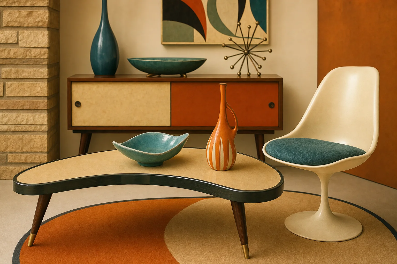
A partial inventory of Populuxe’s material culture: the starburst clock (in dozens of variants, none with the name on it), the kidney-shaped coffee table with the tapered legs, the Hi-Fi console in walnut with the angled front, the ball chair, the lava lamp (technically 1963, which is close enough), the Formica countertop in a boomerang pattern, the chrome dinette set with the vinyl chairs in red or turquoise, the plastic television encased in walnut-print housing, the car with the fins.
The fins deserve a word because they are the part of the era’s design that later critics found most embarrassing, and the embarrassment is interesting. The tail fin began as an aviation-inspired idea, introduced on the 1948 Cadillac by Harley Earl’s styling team at General Motors, who drew the shape from the twin tails of the wartime Lockheed P-38 Lightning fighter plane. By the mid-1950s, the fin had lost any aerodynamic function it might once have had. It was pure form: a gesture toward speed and flight and the future, applied to a machine that drove on roads at speeds for which a fin made no physical difference. The critics called this dishonest.
Hine’s counterargument is more interesting. The fin was not dishonest about what the car could do. It was expressive about how the car made you feel, and how you might feel about the future you were driving into. This is what ornament has always done: it makes claims about values, not specifications. A cathedral makes claims about eternity using stone. A Chrysler 300 makes claims about ambition using chrome and fins. The claim is legible, and the people who wanted to make it were not fools for wanting to make it in the form most available to them.
Where the Word Fits in the Broader Story
Mid-century modern is the design category; Populuxe is a subset of it, and the subset we are most interested in. The broader MCM category includes the Case Study Houses, the Eames furniture, the Scandinavian modernism that arrived in American consciousness in the same decade, and the corporate modernism of the postwar office building. These are all legitimate parts of the story.
Populuxe is the part that was not designed for clients with discerning taste or architectural training. It was designed for the American middle class at the moment of its greatest purchasing power, and it was made with the confidence that the middle class deserved something genuinely beautiful rather than merely functional. This democratic impulse is not a lesser version of modernism. It is a specific version of modernism with specific commitments, and those commitments have held up better than the critics who dismissed the era anticipated.
The starburst is still on the wall. The boomerang is still on the coffee table. The jewel tones are still in the kitchen of everyone who can think of a better color than gray. The design of the era was popular because it was good, and it is still popular for the same reason.
Why the Word Matters
Having a name for something changes your relationship to it. Before Hine’s book, people who responded to the visual culture of the 1950s had to explain what they were responding to without being able to name it. They liked the starbursts and the boomerangs and the tail fins but could not say why that cluster of preferences was coherent, or what it meant about the era, or what distinguished it from nostalgia.
Populuxe gives the cluster a name and the name gives it a history. The starburst clock is not just a vintage object; it is a product of a design culture with a specific set of commitments, a specific historical moment, a specific argument about what ordinary people deserved from their environment. Knowing this does not make the clock more beautiful. It makes your appreciation of it more accurate.
The prints in the Geometric Abstract collection are Populuxe prints: starbursts and boomerangs and atomic-era geometry, made to contemporary standards and sized for contemporary walls, but working from the visual vocabulary that Hine was describing. The link between the mid-twentieth century and the wall of a 2026 apartment is direct, and it is not nostalgia. It is recognition: the shapes were good then, and they are good now, and the only difference is that now we have a word for why.
The history of mid-century modernism covers the broader context, from the Bauhaus origins through the postwar American expansion. Populuxe is one chapter of that history, and arguably the most democratic one. It is the chapter where the design filtered all the way down, and the people it filtered to made something genuinely good with it.