Mid century modern art prints occupy a specific and satisfying space in the world of wall art. They are bold without being aggressive, graphic without being cold, and rooted in a design era that understood how rooms should feel. The mid-century modern movement, which ran roughly from the late 1940s through the late 1960s, produced a visual vocabulary built around clean geometry, organic shapes, jewel-toned color, and a deep belief that good design belonged in every home. At Mid Mod Style, we have organized our entire print collection around that vocabulary. This guide covers every collection we offer, how to choose the right print for your room, what size to order, and how to think about color.
What Makes an Art Print Mid-Century Modern
The short answer is this: the image derives from the visual language of the mid-century modern movement. That language has several signatures. Geometry is one, specifically the kind that the postwar era loved: starbursts, boomerangs, kidney shapes, atomic orbits, and the angular lines of Googie architecture. Organic forms are another, the sinuous curves that Charles Eames pulled into his furniture and that California living rooms celebrated on their walls. Color matters too. The era favored warm, saturated tones, burnt orange, avocado green, harvest gold, alongside clean black and white compositions and the cool blues and teals of Space Age optimism.
A print is mid-century modern not because it is old but because it draws from that visual inventory deliberately. A starburst composition in black ink printed on matte paper carries the same design sensibility as a 1957 Danish textile. That is the point.
At Mid Mod Style, we work in two color stories: Black Ink prints that lean into the contrast and clarity of classic MCM graphic design, and Red Oak prints that bring warm, amber-toned pigments into the same compositions. Every print in our catalog is available in both colorways, which gives you a genuine choice about how the piece will feel in your specific room.
The 7 Print Collections at Mid Mod Style
We organize our 46 prints into seven collections, each rooted in a distinct corner of the mid-century modern visual tradition.
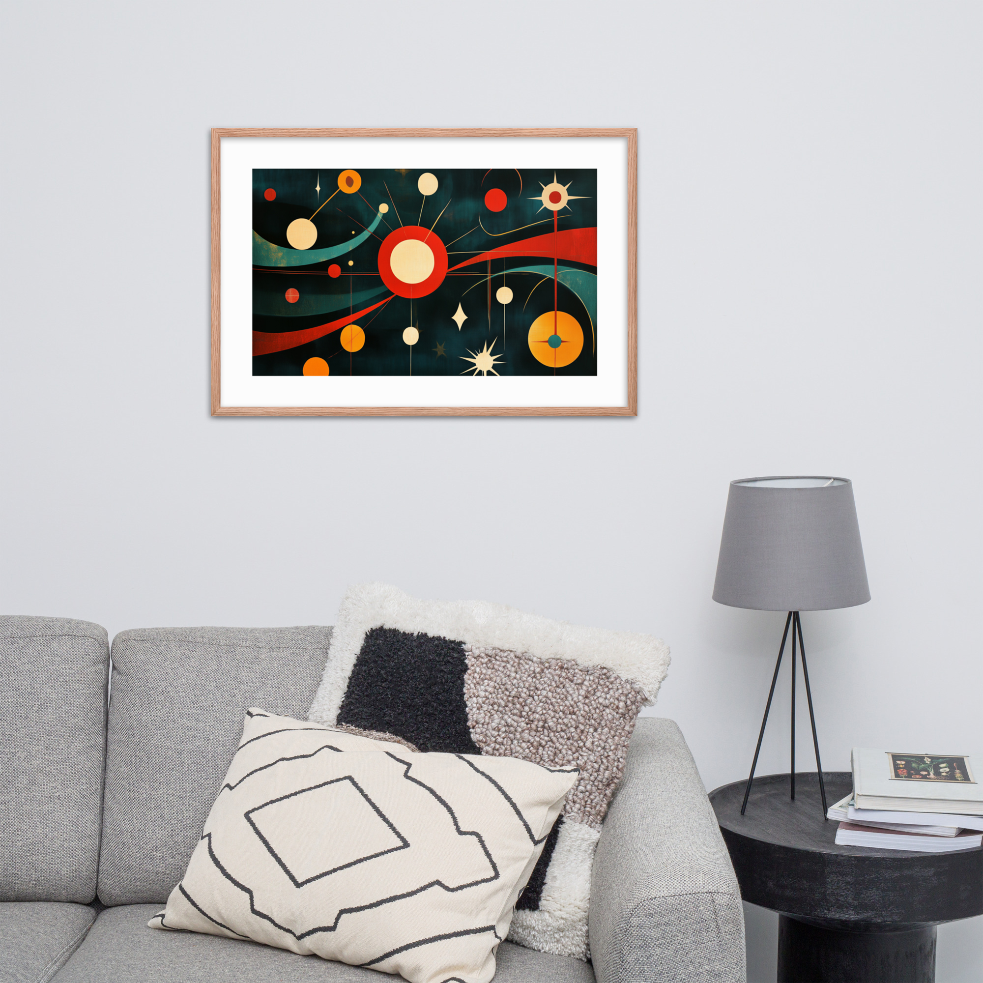
Geometric and Abstract is our largest collection at 10 prints. This is the collection for buyers who want pure MCM graphic energy: starburst compositions, op art patterns, and the bold geometry that defined everything from 1950s textiles to 1960s record cover art. Start here if you want a strong focal point that reads as unmistakably mid-century. See the full Geometric collection.
Botanicals brings the mid-century love of organic form into nature imagery. Seven prints featuring trees, birds, and botanical compositions, some rendered in high-contrast black and white, others in the warm pigments of the Red Oak colorway. The Botanicals collection works especially well in rooms that already use natural materials: walnut furniture, rattan, linen.
Pop Art and Portraits is eight prints that bring human presence into the MCM interior. Bold portrait compositions influenced by the visual strategies of 1960s pop art, where strong color, flat shapes, and graphic clarity turn a face into a design statement. Browse the Pop Art collection.
Space Age covers six prints rooted in the era when the mid-century modern aesthetic met the Space Race. Retro robots, rockets, galactic motifs, and the specific kind of atomic-age optimism that believed the future would look like a World’s Fair. The Space Age collection.
Mid-Century Architecture celebrates the homes that defined the era: the low-slung Case Study houses, the flat-roofed Eichler designs, the postwar California homes where indoor and outdoor living merged. Six prints for buyers who love the buildings as much as the furniture. See the Architecture collection.
Landscape and Quiet Scenes is our most serene collection: five prints featuring sunsets, forests, winter skies, and the kind of calm that the mid-century modern interior always made room for alongside its bolder statements. The Landscape collection.
Classic Cars captures the era when American automotive design hit its peak. Four prints for buyers drawn to the fins, chrome, and showroom energy of 1950s and 1960s automobile culture. The Classic Cars collection.
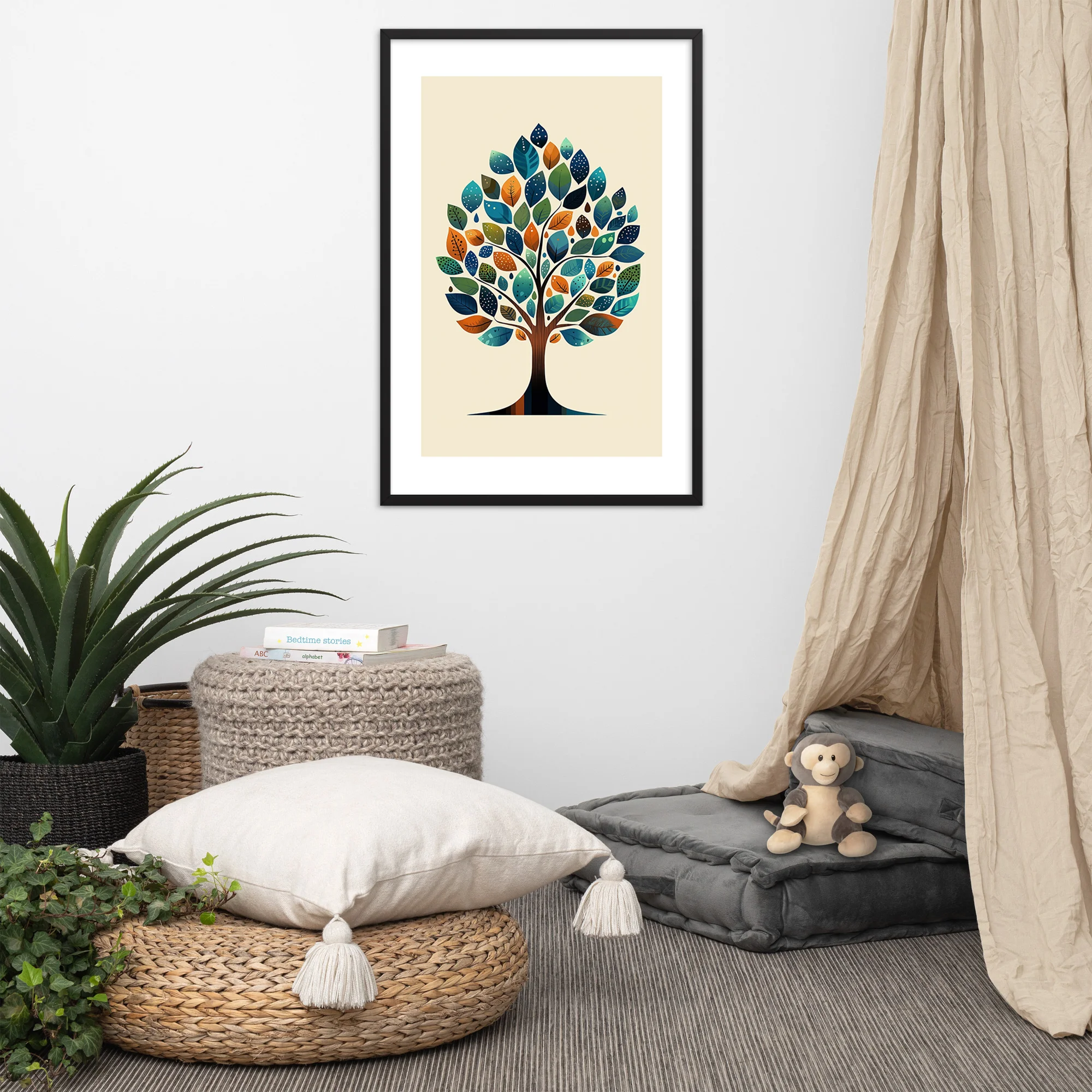
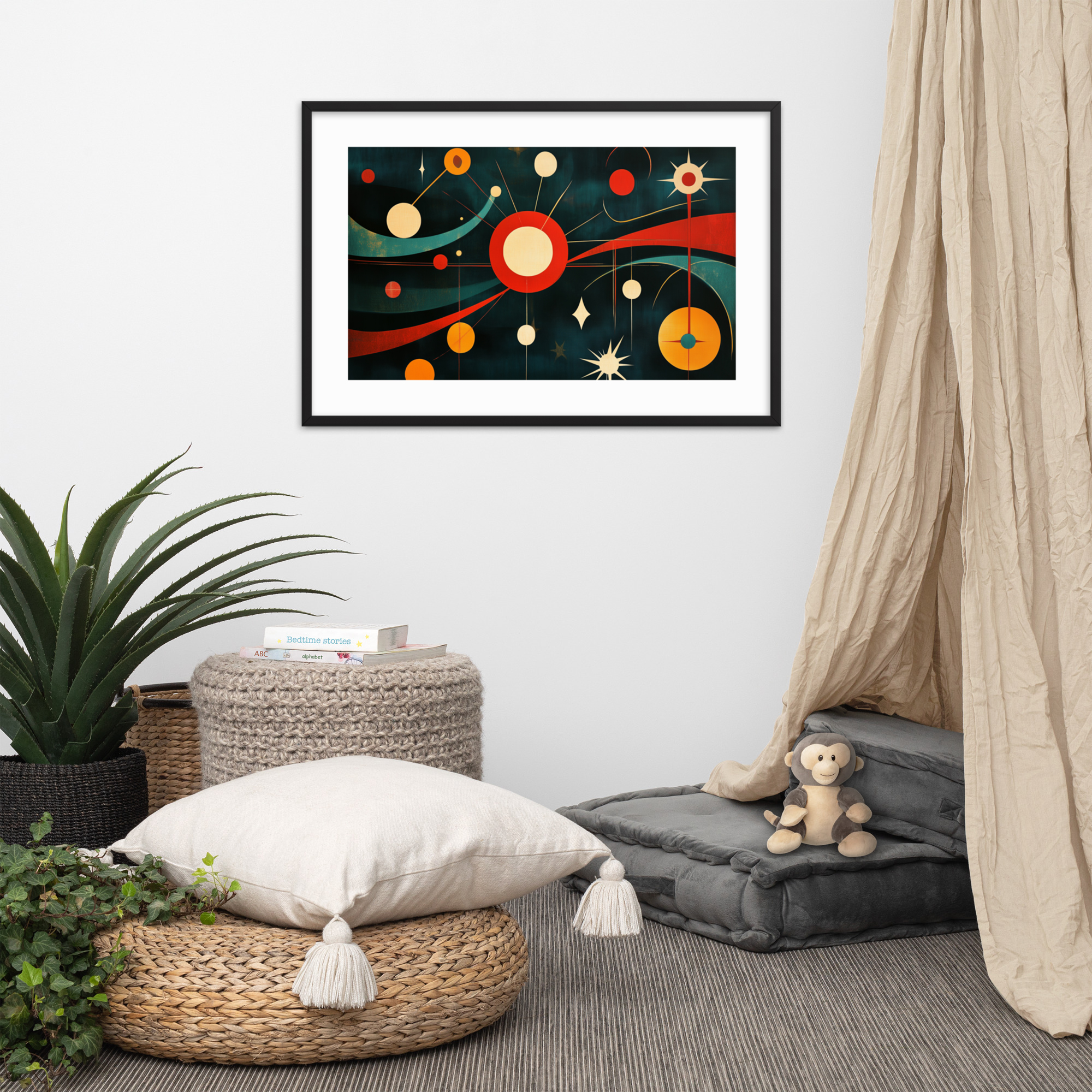
One print that illustrates the Geometric collection’s range is Galactic Retro Vibes, a starburst-and-orbit composition in jewel tones that anchors a wall with direct graphic energy. On the Botanicals side, Vivid Tree of Life shows how the Red Oak colorway brings warmth to a natural subject.
Choosing the Right Print for Your Space
The question we hear most often is not which print to buy but which room to start with. Our room-by-room guide goes into detail on each space. The short version is this.

Living rooms call for anchor prints: pieces that establish a focal point, typically a 24×36 above a sofa or on a primary wall opposite the entry. The geometric and architecture collections tend to work well here because they carry enough visual weight to hold a large wall.
Bedrooms call for calm rather than statement, which is why the landscape and botanical collections find their most natural home there. A 24×36 above the bed in the Black Ink colorway gives you graphic contrast without aggression. The Red Oak colorway in a landscape composition brings warmth and a sense of dusk or early morning that suits a room designed for rest.
Home offices are where the space age and classic car prints earn their place. These collections carry a specific kind of energy, forward-looking and achievement-adjacent, good for a room where work happens.
Understanding Size: From 12×18 to 24×36
We offer every print in exactly three sizes: 12×18, 18×24, and 24×36. That is intentional. A gallery with unlimited sizes creates decision paralysis. Three sizes, chosen to cover the full range of residential wall contexts, makes the decision cleaner.
12×18 is the right choice for small walls, gallery wall compositions, and situations where you want a print that reads as one element in an arrangement rather than a standalone focal point. A 12×18 in a hallway, above a shelf, or stacked with two others in a grid is exactly what this size is designed for.
18×24 is the most versatile size in the catalog. It is large enough to stand alone on a standard wall but compact enough to work in rooms where a 24×36 would overpower the space. If you are unsure what size to order, 18×24 is the reliable choice for most walls in most rooms.
24×36 is the large-format option, the print that occupies a focal wall, dominates above a sofa, or holds the primary visual weight in an open-plan living space. At 24 inches wide, it commands attention. This is the size you choose when you want the print to be the room’s primary art statement.
For a full breakdown by room, viewing distance, and wall width, read our dedicated Art Print Size Guide.
Black Ink or Red Oak: The Two Color Stories
Every print in our catalog exists in two colorways. This is one of the things that sets Mid Mod Style apart from a standard print shop. We have organized the entire catalog around a color decision that matters for how a room feels.
Black Ink prints render the composition in the high-contrast graphic mode of classic MCM design. The primary palette is bold, saturated color against white ground, or pure black and white in the more graphic pieces. These prints read with clarity and crispness. They suit rooms with white walls, light wood furniture, and the kind of clean-lined MCM interiors that favor contrast over warmth.
Red Oak prints shift the whole palette toward warm amber and burnt tones, as if the image had been lit by late afternoon light. The same starburst composition that reads as sharp and modern in Black Ink becomes organic and warm in Red Oak. These prints suit rooms with warmer wall colors, natural wood, and mid-century interiors that lean toward the California Modernism aesthetic rather than the Scandinavian-influenced clean-line version.
The full color story guide is here: Black Ink or Red Oak: Choosing Your Color Story.
Framing Your Print: What Works with MCM Decor
Our prints arrive ready to frame. The question of which frame to choose is worth thinking through before the print arrives.
The MCM interior favors thin metal frames, particularly in black, dark brass, or brushed aluminum. Wood frames in walnut or teak also work well, especially in rooms that already use warm wood tones in the furniture. What the mid-century modern interior generally avoids is the ornate, the thick, and the gilt. Heavy gilded frames fight the composition. The MCM aesthetic is built on precision and a refusal to decorate beyond necessity.
For the Black Ink colorway, a thin black metal frame is almost always right. For the Red Oak colorway, a thin walnut-stained wood frame or a raw oak frame extends the warmth the colorway already carries.
Our full guide covers matting, frame proportions, and the specific frame styles to avoid: Framing Mid-Century Modern Art Prints.
Giving MCM Prints as a Gift
Art prints are exceptional gifts for a specific reason: they are personal without being presumptuous. You are not choosing what the recipient should wear or how they should smell. You are adding something to their wall that they get to place where it makes sense for them.
Mid-century modern prints in particular work as gifts because the aesthetic has broad appeal and reads as considered rather than generic. A starburst print framed in black metal is a gift that says you paid attention to what someone’s home looks like. The Space Age and Classic Cars collections are especially strong for the design enthusiast in your life.
For specific gift recommendations by recipient type and occasion, read our Mid-Century Modern Gift Guide.
Browse the full catalog and both color stories at our shop, or start with any of the seven collection pages above to find the prints that match what your room needs. Every print is made to order, framed in black or red oak, and available in all three sizes.
What to Look for When Buying Mid-Century Modern Art Prints Online
The challenge with buying wall art online is the gap between how a print looks on a screen and how it reads on a wall. Screen brightness inflates contrast and saturates color in ways that do not always translate to a physical print. A few checks before you buy:
Scale is the most commonly misjudged variable. A print that looks substantial in a product photograph may be 12×18, which is a generous size for a gallery wall arrangement but modest as a solo piece above a sofa. We offer three sizes: 12×18, 18×24, and 24×36. Our size guide walks through what each format is suited for, but the simplest starting point is this: measure the wall space you are buying for before you look at prints, not after. Most buyers underestimate the size they need and over-estimate the size the room can carry.
Color story is the second variable. Our Black Ink prints read crisper on screen than they do in real room light, where they warm slightly depending on the light source. Our Red Oak prints may read more intensely saturated on screen than they do in the diffuse light of a north-facing room. If you are unsure which color story reads better in your room, the rule is: warm rooms take Red Oak, cool rooms take Black Ink. Our full color story guide explains the logic in more depth.
Composition at distance is the third check. Open the product image, step back from your screen until it is small, and see whether the composition still reads. Prints that hold their interest at reduced scale are the prints that will work at distance in a room. Fine-detail or small-pattern prints that lose their quality when the image is small will also lose their quality on a wall viewed from ten or more feet away.
Building Your Mid-Century Modern Print Collection Over Time
Most buyers do not start with a fully realized wall arrangement. They start with one print, hang it, and think about what comes next. This is a perfectly valid approach to building a MCM print collection, and the hub-and-spoke structure of the MCM aesthetic actually rewards incremental building in a way that more maximalist styles do not.
Start with the anchor print: one piece for the most prominent wall in the room you are working on. In a living room, that is typically the wall behind the primary seating arrangement. In a bedroom, it is the wall above the headboard. In a home office, it is the wall behind the desk. Choose this print for its composition and its compatibility with the room’s existing palette. The framing choice follows from the print’s color story.
The second print introduces variety. If the first print was in the Black Ink color story, consider the Red Oak story for the second, on a different wall. If the first was geometric, consider a botanical or landscape as the second choice: subject contrast with tonal coherence is the pairing logic that works best across two different print subjects in the same room or in adjacent rooms with a sightline between them.
Gallery arrangements come third, not first. The most common sequencing error is planning a gallery wall before understanding what any individual print looks like in the actual space. A gallery wall is a design decision that benefits from knowing the room’s light, the wall’s spatial relationship to the furniture, and the viewing distance. All of those things become clear from hanging one print, living with it for a few weeks, and then planning around it. Our gallery wall guide covers the layout principles in detail, and the framing guide covers the frame decisions that create visual cohesion across multiple prints.
Mid Mod Style Print Collections: A Room-by-Room Starting Point
If you are not sure which collection to start with, here is a practical starting point organized by room:
For living rooms, the geometric and pop art collections produce the strongest statement pieces. Bold composition at scale reads well from a distance and anchors the room’s primary wall without requiring supporting pieces to complete the effect. Both the geometric and the pop art collections have prints suited to the 18×24 and 24×36 formats that work best in living room contexts.
For bedrooms, the landscape and botanical collections lead. Both offer the quieter, more organic compositions that work in a room intended for rest. The landscape collection in particular provides the serene but visually interesting quality that a bedroom wall needs: not neutral enough to disappear, not dynamic enough to disturb.
For home offices, the geometric and classic car collections are the strongest choices. The graphic clarity of geometric prints and the purposeful specificity of the automotive collection both anchor a workspace in ways that softer or more atmospheric prints cannot. For more detail, visit our home office guide.
For gift purchases, the classic car and space age collections lead, followed by botanicals. Both car and space age prints appeal to a specific enthusiast audience that makes them more personally meaningful as gifts than the more universally aesthetic botanical or geometric choices. For a full gift guide organized by recipient type, visit our gift guide.