

The most common mistake when someone falls for mid-century modern is the assumption that they need to start over. New sofa. New credenza. Maybe a different floor lamp. The whole room, restarted. They go looking for a 1958 credenza on Chairish, price it, and either spend too much or settle for a reproduction that sits in the room feeling apologetic. The room ends up looking like a set. The 1962 sofa is uncomfortable. The side tables are too precious to use. Visitors notice the effort.
The rooms that actually work do not look like this. They look like someone with a point of view who happened to own different things across different decades and arranged them well. A Saarinen Tulip table next to chairs they bought in 2019. A teak credenza under a television that would have been science fiction in 1965. A print on the wall that carries the geometry of the era without being a period piece. Those rooms breathe. They work because whoever furnished them was willing to cheat.

The case we want to make is simple: cheat more.
The Time-Capsule Problem
The time-capsule room is a coherent idea that is wrong about why mid-century modern is appealing. The design of that era endures because of what it solved: rooms that felt overloaded, furniture that announced status by crowding it, interiors where nothing had room to be itself. The solution was line, light, and a respect for the room as something worth keeping clear. That solution travels. A contemporary sofa in warm linen, low-profiled with tapered legs, participates in the same solution just as well as a vintage piece. An Eames chair from 1956 sits next to it without complaint.
What does not travel is the signal that you have tried very hard to live in a particular decade. That signal, paradoxically, makes the room look less confident than a room where the edit was looser.
The period interiors of the 1950s and 60s were not period-correct either. People mixed what they had. They kept the furniture from their parents. They bought inexpensive new pieces and expensive old ones in the same room. The photographs we now call iconic MCM interiors were honest accidents. Nobody was trying to make a statement about the decade. They were trying to furnish a house.
What the Style Actually Needs
Before talking about what to mix, it is worth being specific about what mid-century modern actually requires. Not what it conventionally features, but what the style needs in order to read as the style.
It needs low-profile furniture. The silhouette of mid-century design sits close to the ground. Sofas, chairs, and credenzas that ride low create the horizontal emphasis the style is built around. This is the single most important element, more important than any specific piece or material.
It needs clean lines and visible legs. Furniture that shows its structure rather than hiding it behind fabric or paneling reads as of this era. The leg is not decoration. It is the piece being honest about what holds it up.
It needs breathing room. The style collapses when it is crowded. A mid-century room with too much furniture looks confused, not full. The empty space is part of the design.
It does not need to match by era. It needs to match by visual logic.
The Sofa Problem
MCM sofas are well-known for being beautiful and, in many original examples, not particularly comfortable by contemporary standards. Thinner cushions, firmer suspension, proportions designed for a different average frame. A vintage sofa often works better as a statement than as the place where you watch television for three hours on a Saturday.
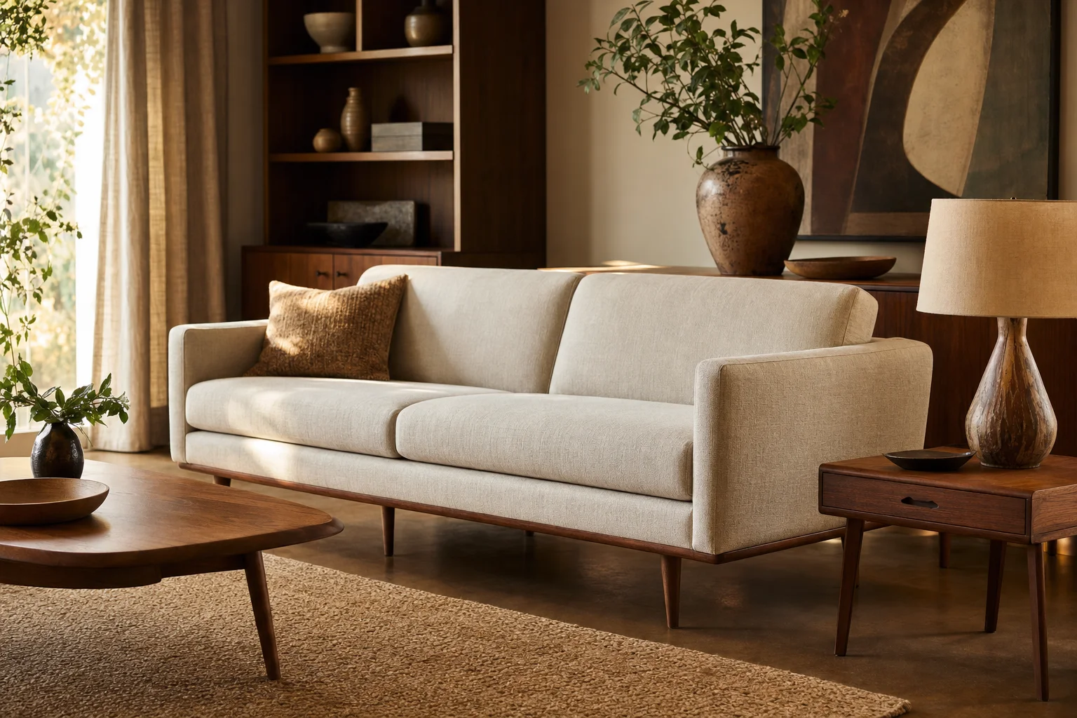
The practical answer is a contemporary sofa in a warm neutral. A linen or boucle piece without heavy arms, or with arms low enough to let the room breathe, participates in the horizontal logic of mid-century design without trying to be a period piece. The key detail is the leg: taper it if you can swap the feet, and the sofa stops fighting the credenza across the room.
This is not a compromise. It is an edit. The distinction matters because an edit has a reason; a compromise is just giving ground.
How to Mix Without Losing the Room
The principle that makes mixed rooms work is that each element has a role. Authentic period pieces earn the strong positions: the chair by the window, the credenza along the dominant wall, the lamp that is also a presence. Contemporary pieces support rather than compete.
Material consistency does a lot of the work. If the period pieces are teak or walnut or another warm wood, the contemporary pieces should complement rather than contrast. Not necessarily the same wood, but not cold steel either, unless the room has already committed to that palette. Mid-century modern is warm more often than it is cool, and that warmth is one of the things that makes it more livable than later modernist styles.
Color works in the same way. The palette of the era was specific: warm neutrals for the dominant surfaces, a jewel tone or a period-appropriate accent, coral, turquoise, chartreuse, for emphasis. You do not need to replicate this exactly. But a room of gray furniture against white walls will work against MCM pieces rather than with them. The chairs will look marooned.
The rule about mixing eras and styles is simpler than it sounds: one visual logic, more than one decade. Pick the logic, not the decade, and the mix handles itself.
Art as the Fastest Bridge
The shortest path between the room you have and the room you want is almost always a print. Art changes the visual vocabulary of a room without moving a single piece of furniture. And the graphic vocabulary of mid-century modernism, the starbursts and boomerangs of the Atomic Age, the strong botanical illustration of someone like Charley Harper, the geometric boldness of the era’s graphic design, carries very well across decades without requiring everything around it to conform.
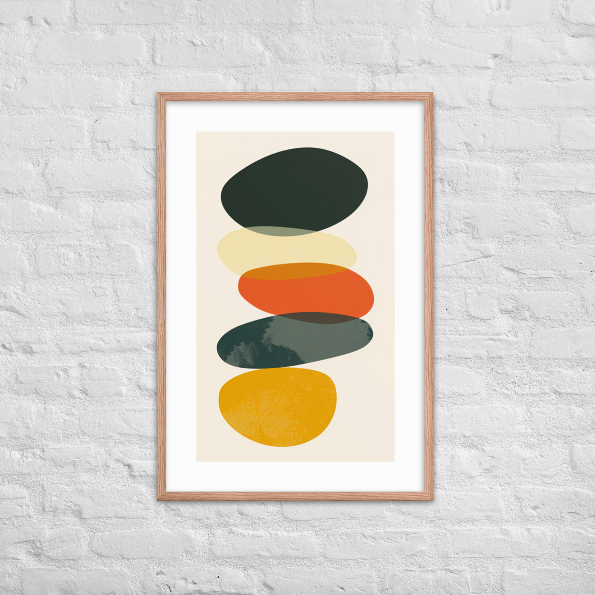
It also gives permission. A room with a print that carries the geometry of 1958 does not need to be a 1958 room in order for the print to make sense there. It works the other way: the print lends a visual logic that pulls other elements toward it. The room starts reading as coherent because one element says what it is, clearly and without apology, and the rest of the room organizes around that clarity.
A print is also one of the few moves that is reversible without a hole in the wall you regret. It is a low-stakes test of how much further the room wants to go.
The complete guide to mid-century modern art prints covers how to think about size and scale relative to the wall and the furniture below it. The short version for a mixed room: go bigger than instinct suggests, and hang it where it anchors rather than decorates.
Six Moves, in Order
For a room that is not starting from scratch, the sequence matters. These are the changes that return the most for the least commitment, ordered by how much they give back for what they cost.
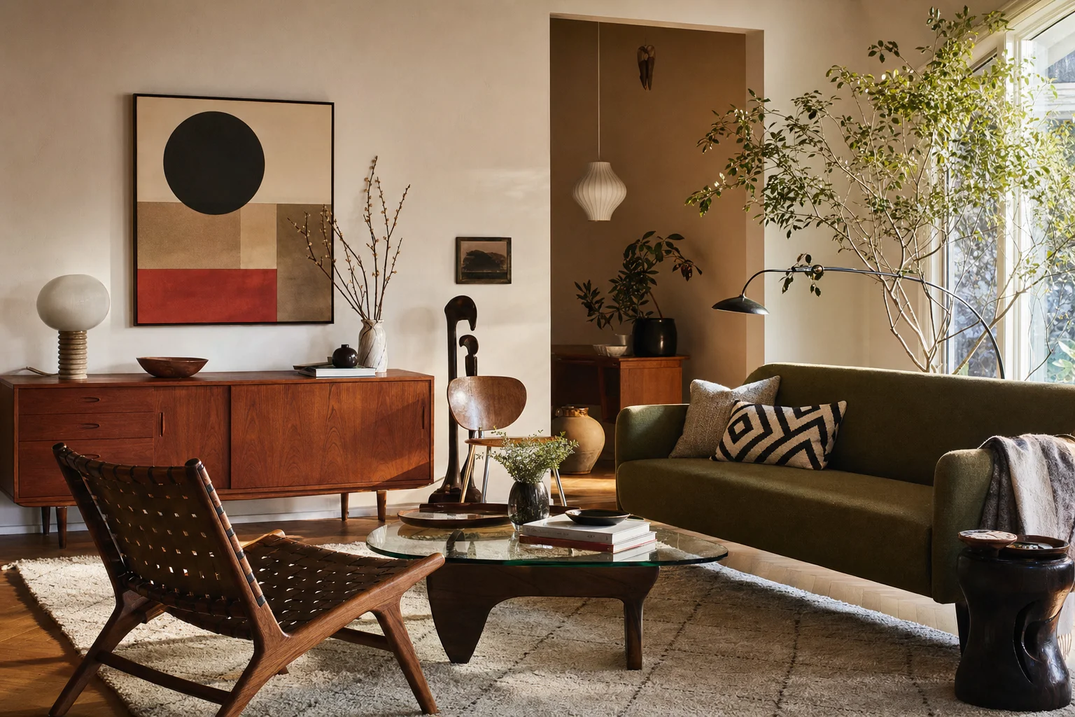
Start with the lamp. A floor lamp or table lamp with a period silhouette, a tripod base, a mushroom shade, a simple taper, changes what the room looks like at night and is one of the least expensive authentic MCM pieces to find secondhand. The room looks different after dark.
Add a print before you change any furniture. See how the room responds to the visual language before spending money on pieces. A print tells you whether the room wants to go further or is already where it needs to be. This step costs less than one piece of furniture and gives you far more information.
Replace the rug if you have one that fights the furniture. A low-pile solid or a simple geometric, not a busy traditional pattern, gives the room the neutral ground it needs. The credenza and the chairs stop competing with the floor.
Recover what you have before buying new. A chair with good bones and a dated fabric can become a different piece of furniture with a solid upholstery in a warm tone. This is often cheaper and better than a replacement.
Add a credenza or a low console if the room does not have one. The horizontal line of a credenza is one of the most effective ways to signal the era, and it doubles as storage. It does not have to be vintage to work.
Then address the sofa if and when it needs replacing. Not before.
The Argument Against This (and Why We Disagree)
There is a view that mixing dilutes the style, that if you are going to commit you should commit. The rooms that look most like the design textbooks are the rooms where this argument won.
We disagree, not on taste grounds but on historical ones. The most celebrated mid-century interiors, the Case Study Houses among them, were experiments in living rather than museums of it. They were built around the idea that good design should be affordable, adaptable, and honest about how people actually used a house. Nobody was preserving anything. They were building something forward.
A room that mixes well is more faithful to that spirit than a room that only mixes period pieces. It is also far easier to live in.
The room-by-room decorating guide covers how different rooms handle the balance differently. The living room rules are different from the bedroom rules, and both are different from the home office. Start there if you are thinking about the whole house rather than one room at a time.
One print worth noting for a mixed room: Monochrome Harmony works in almost any context and is a good first test of whether a room is ready for a stronger geometric statement. If it looks right, you have more room than you think. If something feels slightly off, the problem is usually in the furniture, not the art.