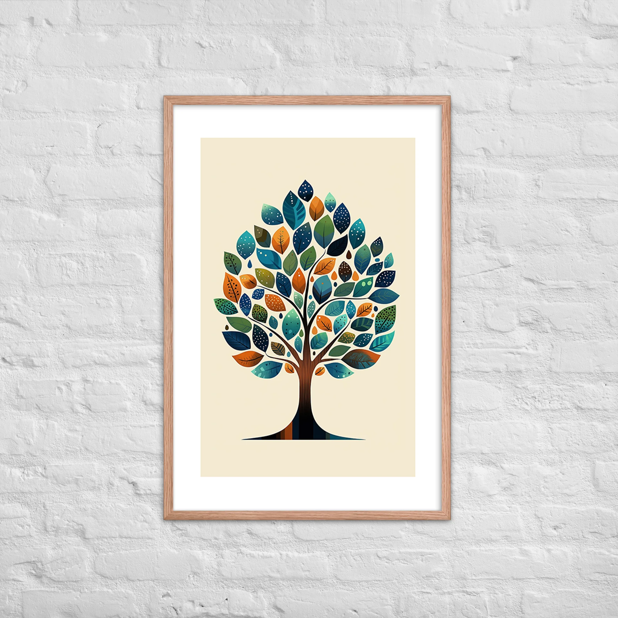
The frame is the last decision most buyers make, and it is often the one that most determines how a print lands on the wall. A great print in the wrong frame reads as unfinished. A simple print in the right frame reads as intentional design. Mid-century modern art prints are particularly sensitive to framing because the MCM aesthetic has a clear material vocabulary, and frames that violate that vocabulary do not just look wrong, they undermine the print’s ability to do what it was designed to do. Before choosing a frame, know your print size and your wall. For guidance on choosing between our 12×18, 18×24, and 24×36 options, read our art print size guide. For a complete introduction to our collections, start with The Complete Guide to Mid-Century Modern Art Prints.
Framing Principles for Mid-Century Modern Interiors
Mid-century modern design is organized around three values in material choice: restraint, honesty, and functionalism. These principles translate directly to frame selection. The right frame for an MCM print does not call attention to itself. It mediates between the print and the wall, holds the composition, and recedes. The wrong frame does the opposite: it introduces ornament or visual weight that competes with what is inside it.
The most common framing mistake with MCM prints is not an ugly frame: it is an irrelevant frame. A frame that belongs to a different aesthetic tradition, baroque, Scandi, industrial farmhouse, does not create interesting tension with an MCM print. It simply reads as a mismatch. The frame and the print should come from the same conversation about how objects should look, even if the frame does not need to be a period piece.
Metal Frames: Thin, Dark, and Minimal vs. Gold and Ornate
Thin metal frames are the most historically consistent choice for MCM prints. The slender metal frame emerged in the mid-century period as picture framing followed the same logic as furniture: less material, more presence, the reduction of visual noise at the object’s border. A frame in matte black or dark bronze, somewhere between three-eighths and three-quarters of an inch wide, sits correctly around almost any MCM print without making the frame a statement of its own.

The finish matters as much as the width. Matte black is the most versatile choice: it anchors the print’s edges without reflecting light or competing with the image. Dark bronze reads as slightly warmer and works particularly well with Red Oak color-story prints, where the warmth of the frame continues the warmth of the print rather than interrupting it.
Shiny chrome finishes are a different matter. Chrome is not inherently wrong, but it reads as contemporary rather than MCM, and against a Black Ink print the reflection can create a visual conflict at the border that pulls attention away from the print. If you prefer metal, the safe direction is toward matte or brushed rather than polished.
The dimensional advantage of thin metal frames: they are available from standard-sizing suppliers without custom work. Our 12×18, 18×24, and 24×36 prints slot into off-the-shelf thin metal frames without adjustment, which keeps cost down and makes replacement straightforward.
What to avoid in metal frames at all price points: wide metal frames, shiny chrome, and the ornate gilt frames that belong to a European traditional interior tradition. A gilt frame signals a different set of values than an MCM print, and the combination reads as confused rather than eclectic.
Wood Frames: Natural Walnut and Teak Complement the MCM Palette
Natural wood frames in walnut or teak occupy a different but equally valid place in the MCM interior. Where a thin metal frame recedes, a natural wood frame contributes. The grain of the wood becomes a textural element that reads alongside the print rather than merely around it. This is not a problem: the MCM tradition used natural materials precisely because their visible grain and texture were considered honest rather than decorative. A walnut frame is honest about what it is in a way that a lacquered or painted frame is not.

The rules for wood frames with MCM prints are consistent: the grain should be visible, the finish should be matte or satin, and the profile should be simple and flat. A carved wood frame is a European traditional frame. A painted white frame is Scandinavian. Neither is wrong for what it is, but neither reads as MCM, and the combination with an MCM print will register as mismatched to any viewer who is paying attention.
Walnut reads well with both Black Ink and Red Oak prints. Against a Black Ink print, the warmth of walnut provides a temperature contrast that helps the print’s subject define itself against the frame. Against a Red Oak print, walnut extends the warmth of the print into the frame and creates continuity that deepens the effect of both.
Teak works the same way but reads slightly denser and more golden than walnut. It pairs particularly well with the warm terracotta tones of our botanical and landscape prints in the Red Oak color story, where the similarity in warm register creates a unity that a cooler wood or metal frame would not achieve.
To Mat or Not to Mat: When Extra White Space Helps
A mat adds visual breathing room between the print and the frame. In the MCM tradition, mats are used when they serve the composition rather than as a default. The key question is whether the print’s composition already has visual rest at its edges. If the print has design elements running to the edge of the paper, a mat creates the rest the composition needs. If the print has its own built-in margins or substantial negative space near the borders, a mat can feel redundant and reduces the visual footprint of the print itself.
When matting MCM prints, keep the mat white or cream. A colored mat shifts the color balance of the image toward the mat tone, and in most cases that is not what you want. White is almost always right. Cream works with warmer prints where a pure white would introduce a cooler note that does not belong. Neither should carry any texture that reads as linen or fabric: textured mats belong to a different aesthetic tradition entirely.
For gallery wall arrangements, consistent matting creates a visual rhythm that helps disparate print subjects read as a deliberate set rather than a collection of individual pieces. Matching mat widths across all prints in a gallery arrangement is a simple way to create cohesion without requiring the prints themselves to be in the same collection or color story. For guidance on putting a gallery wall together from scratch, visit our gallery wall guide.
What to Avoid: Frame Styles That Fight the Print
Beyond the specific failures already noted, the general rule is that ornament is the enemy of the MCM frame. No gilt, no carved wood, no thick beveled profiles, no shadow boxes unless the object inside is genuinely three-dimensional. These belong to different aesthetic traditions, and introducing them into an MCM context does not create interesting contrast: it creates visual confusion about what design era the room is operating in.
Clip frames, which hold the print against the glass with corner hardware and no actual frame, are a minimal option that can work for a temporary placement or a test arrangement. They are not a finished solution for a print you intend to live with. The clips themselves introduce a casual note that is at odds with the MCM interior’s sense of composed restraint, and the absence of a frame profile means the print has no defined boundary on the wall.
Floating frames, where the print appears to float between the backing and the glass without touching any border, are a contemporary approach that can work with MCM prints if the frame itself follows the thin-profile, matte-finish rules above. The floating presentation reads as intentional rather than casual, which is consistent with the MCM aesthetic.
How the MMS Print Color Story Affects Frame Choice
The choice between our Black Ink and Red Oak color stories is the starting point for frame selection, because color temperature is the most important shared variable between a print and its frame.
Black Ink prints are neutral and high-contrast, which means they accept a wider range of frame materials and finishes. A thin matte black metal frame is the most classic pairing, a frame and print in the same tonal register that produces a unified, graphic object on the wall. Natural walnut also works well and introduces warmth that anchors the print differently, adding a temperature contrast that gives the Black Ink subject something to define itself against.
Red Oak prints carry warmth, which means they benefit from frames that continue rather than interrupt that warmth. Natural walnut or teak is the primary recommendation. Matte black also works as a temperature contrast that sharpens the warm tones of the print rather than competing with them. What generally does not work is a cool metal frame with a warm-toned print: the frame and the print disagree on the question of temperature, and the eye notices even if the mind does not quite articulate the problem.
For more detail on how the two color stories behave across every collection, visit our color story guide. For a complete introduction to placing MCM prints throughout the home, start with The Complete Guide to Mid-Century Modern Art Prints, and browse our full catalog at the shop.