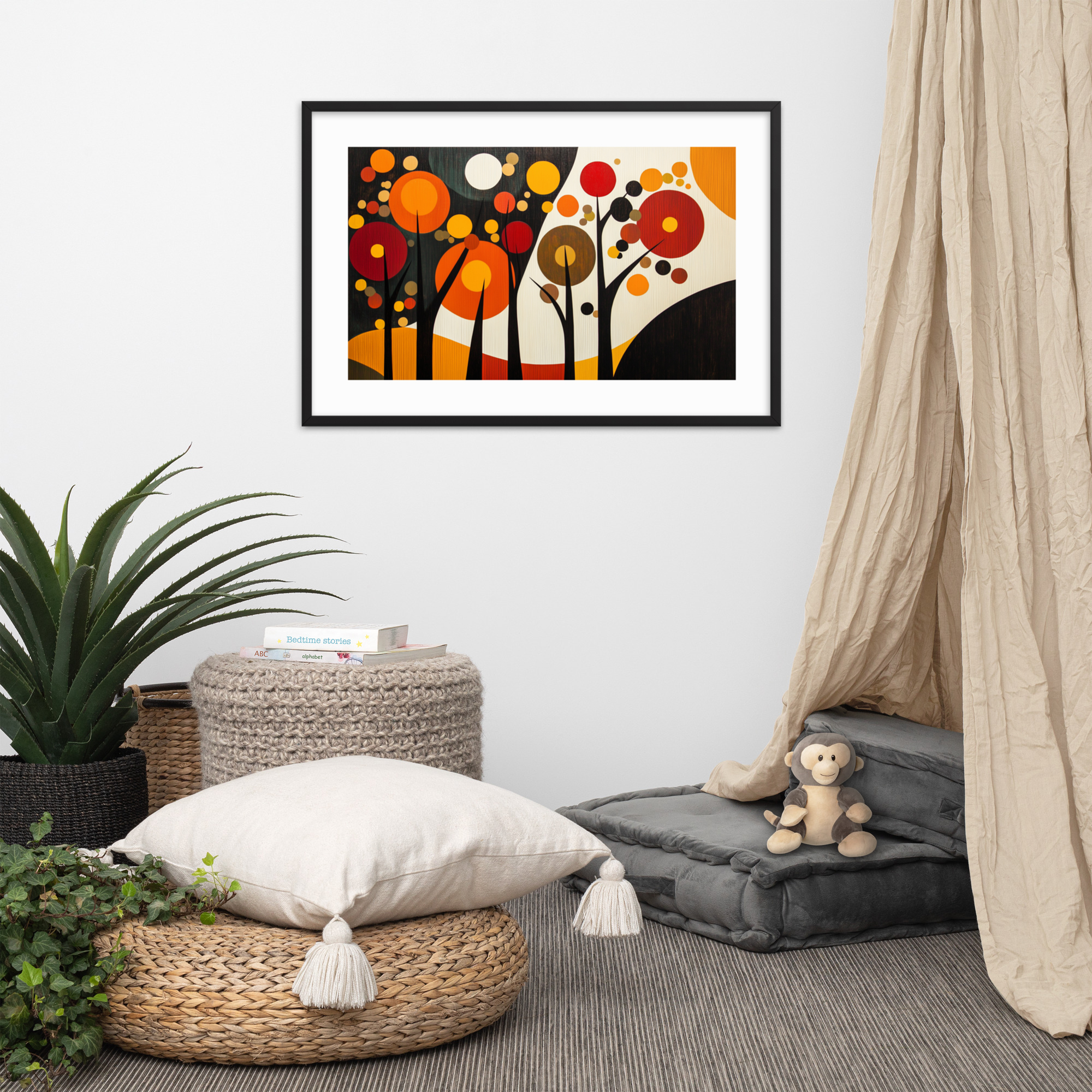
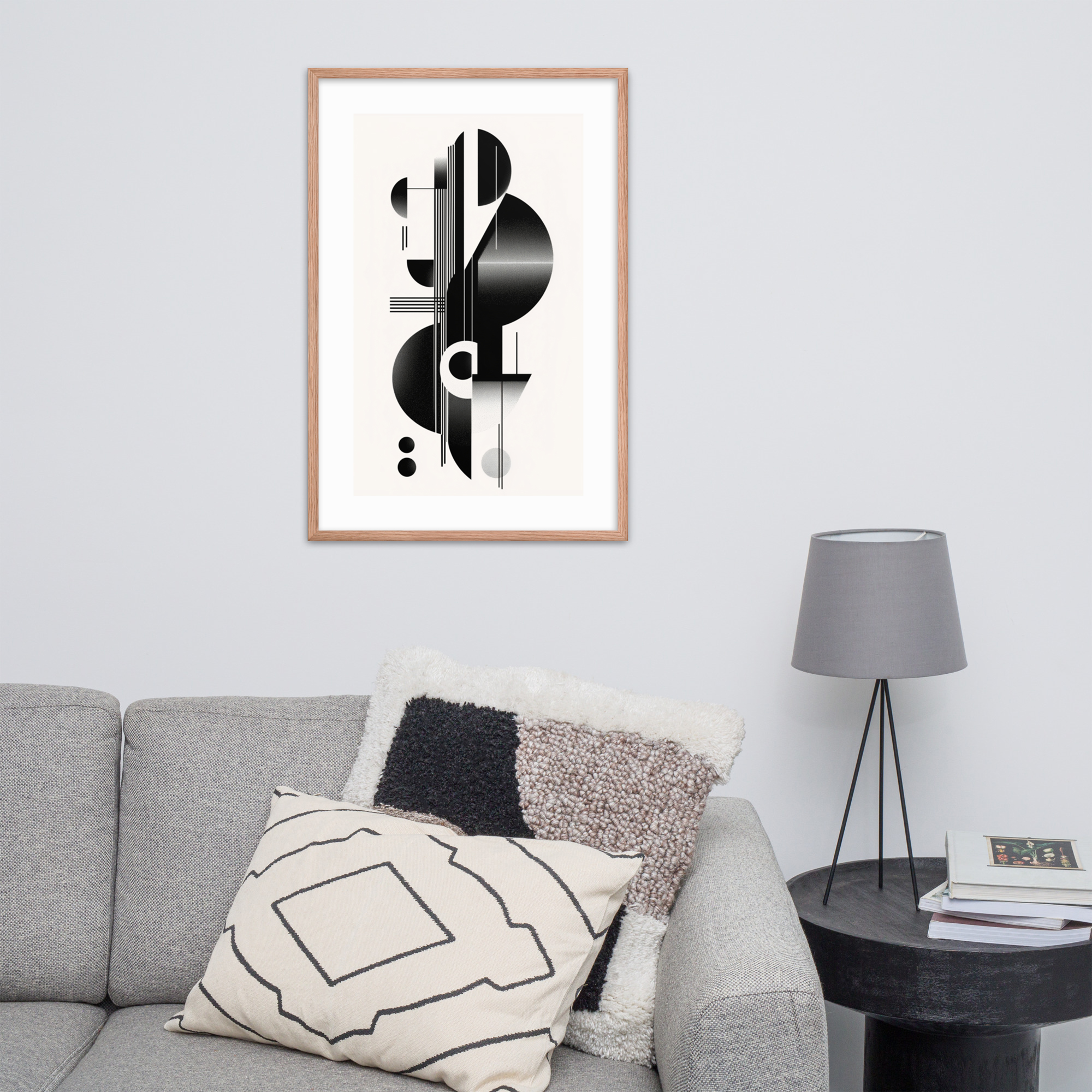
At Mid Mod Style, we made a deliberate choice when we designed our print collections. Every piece comes in one of two color stories: Black Ink and Red Oak. This is not about offering variety for its own sake. It is about acknowledging that the two dominant color systems of mid-century modern design, one crisp and graphic, one warm and organic, read very differently on a wall. Choosing between them is the first design decision you make when buying a print, and it is the one most buyers do not realize they are making. This guide walks you through both color stories, how they interact with different room palettes, and when mixing the two works in your favor. For a complete overview of our full print catalog, start with The Complete Guide to Mid-Century Modern Art Prints.
The Two Color Stories at Mid Mod Style
Every print in our catalog exists in at least one of two tonal registers. The Black Ink color story is exactly what it sounds like: deep, high-contrast line work and pattern rendered in black against cream or ivory backgrounds. The Red Oak color story introduces warm terracotta and amber tones, muted greens, and the kind of palette that reads as natural and organic. Both are mid-century modern in spirit, but they carry very different moods, and they behave differently depending on the room, the wall color, and the furniture palette around them.
Understanding the distinction before you buy is the simplest way to ensure the print you choose reads the way you intended it to read. A Black Ink print placed against a warm-toned interior will work, but it will work differently than a Red Oak print in the same position. Neither is a mistake. They are different design choices, and making them consciously produces better results than making them accidentally.
Black Ink: Contrast, Clarity, and the Classic MCM Look
The Black Ink color story draws from the graphic tradition of mid-century design: the bold line work of Saul Bass, the geometric precision of the poster designers who defined the era’s visual language, the high-contrast imagery that gave the period its graphic clarity. A Black Ink print brings that same clarity to a wall. Nothing competes with the background because the background is neutral, and the subject, whether a starburst, a botanical illustration, or an architectural elevation, reads with immediate precision from across the room.
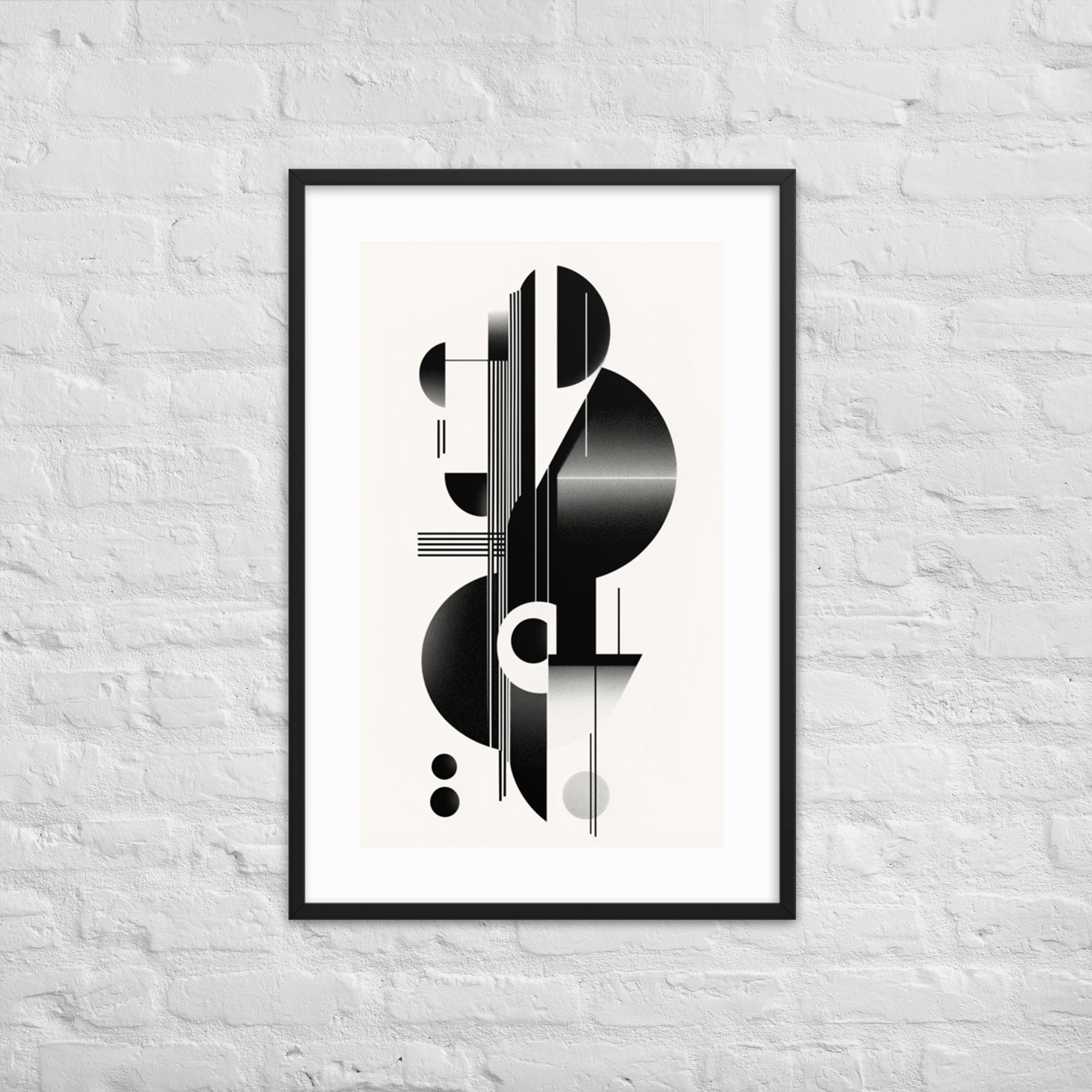
Black Ink prints anchor cool-toned rooms particularly well. A wall painted in white, soft grey, or a blue-green pulls strength from a Black Ink print precisely because they share a crispness of tone. The contrast carries across a room in a way that warmer tones cannot always match. They also work well in high-contrast color environments: a room with dark furniture and light walls gains depth from a Black Ink print rather than softness, and in those contexts that is exactly what the wall needs.
They are also the stronger choice for any surface that needs to assert itself at a distance. A Black Ink print in a hallway, above a stairwell, or on a wall that is seen from fifteen feet away holds its composition at that distance in a way that a more textured or tonally complex print may not. The graphic quality of the Black Ink palette is built for legibility, and legibility at distance is one of the most underrated considerations in wall art selection.
Our Monochrome Elegance print demonstrates the approach at its clearest: a botanical rendered in dense black lines against a pale field, immediately legible from across a room, quietly commanding without ornamentation.
Red Oak: Warmth, Texture, and the Organic Side of MCM
The mid-century modern era was not only a story of precision and geometry. It was equally a story of organic form: the molded plywood chair, the biomorphic shapes of mid-century textiles, the interest in natural materials that ran through Scandinavian design and the American craftsman tradition that paralleled the European influence. The Red Oak color story comes from that side of the movement: warm terracotta, amber, muted sage, and the saturated tones of a vintage travel poster are the vocabulary here.
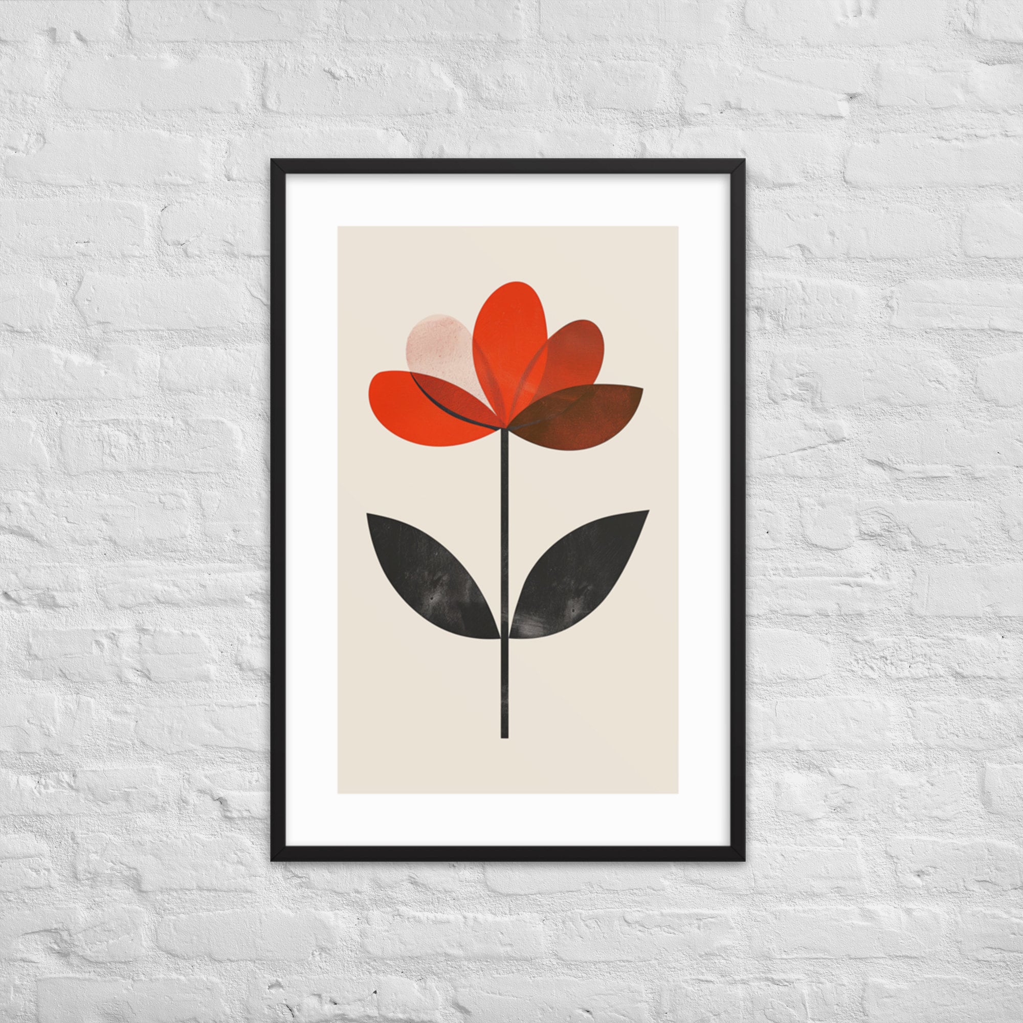
Red Oak prints warm a room in a way that Black Ink cannot. In spaces with natural wood floors, walnut furniture, or walls painted in warm white or off-white, a Red Oak print does not just sit on the wall. It extends the palette the room already carries and deepens it. The print feels less like an addition and more like a natural conclusion to a design logic the room was already following.
They are also more forgiving in rooms with mixed color temperatures. A living room that has both warm and cool tones in its furniture can anchor itself around a Red Oak print because warm tones have more pull than cool ones in a domestic setting. The warmth of a Red Oak print tends to resolve ambiguity in the room’s palette rather than expose it.
Our Vivid Tree of Life is the clearest illustration in the catalog: the subject is botanical, but the color story is unmistakably Red Oak, full of amber and sienna and the kind of warmth that makes a room feel inhabited rather than assembled.
Which Color Story Fits Your Room Palette
The simplest rule: cool rooms take Black Ink. Warm rooms take Red Oak.
A cool room has walls in white, grey, or blue-green. Its furniture tends toward lighter fabrics, chrome, glass, or painted surfaces. The light it receives is northern or filtered. In these conditions, Black Ink prints hold. They do not disappear into the palette and they do not fight it. They are precisely what the room needs on its wall: contrast within a controlled palette.
A warm room has walls in cream, warm white, terracotta, or sage. Its furniture tends toward wood, leather, and natural textiles. The light it receives is warmer, often from southern or western exposure. In these conditions, Red Oak prints extend what is already happening in the room. Black Ink can also work here, but it tends to read as a punctuation mark rather than an integration: a deliberate departure rather than a continuation.
If your room is genuinely neutral, where its furniture and walls are balanced between warm and cool, start with whatever print you are drawn to aesthetically. The two color stories are not so different that a Red Oak print in a cool room is a problem: it is a design choice, not a mistake. But if you want a reliable starting point, the warm-room-to-Red-Oak, cool-room-to-Black-Ink pairing is the most consistent recommendation we can offer.
For color-specific guidance by print subject, the decision is explored in depth in our botanical prints guide and our landscape prints guide, where the colorway contrast between pieces in each collection is most pronounced.
Mixing the Two: When It Works and When It Does Not
There is a version of mixing Black Ink and Red Oak that works well: when both prints are in the same subject family. A gallery wall that pairs a Black Ink geometric print with a Red Oak botanical reads as intentional because the tonal contrast is offset by the visual similarity of the categories. The eye moves between the two and experiences variety rather than conflict.
The pairing that tends not to work is two prints of the same subject in different color stories: two botanical prints side by side, one Black Ink and one Red Oak, will compete with each other. The subject similarity draws the eye to compare, and the tonal difference resolves as inconsistency rather than contrast. The comparison is unflattering to both prints and to the wall they share.
In general, we recommend a single color story per wall. If you want variety across a room, use the second color story on a different wall, in a different room, or in a gallery arrangement where the subjects are deliberately varied. This is the approach most consistent with how we designed the collections, and it produces the most coherent result.
Browse Both Color Stories in Every Collection
Every collection in the Mid Mod Style catalog offers prints in both color stories. The geometric collection is the best starting point if you are new to the catalog: the contrast between a Black Ink starburst and a Red Oak geometric composition demonstrates exactly what each color story does at its most distinct. From there, explore all prints across both color stories at our shop, organized by collection so you can compare colorways side by side and make the decision from the actual images rather than from description.