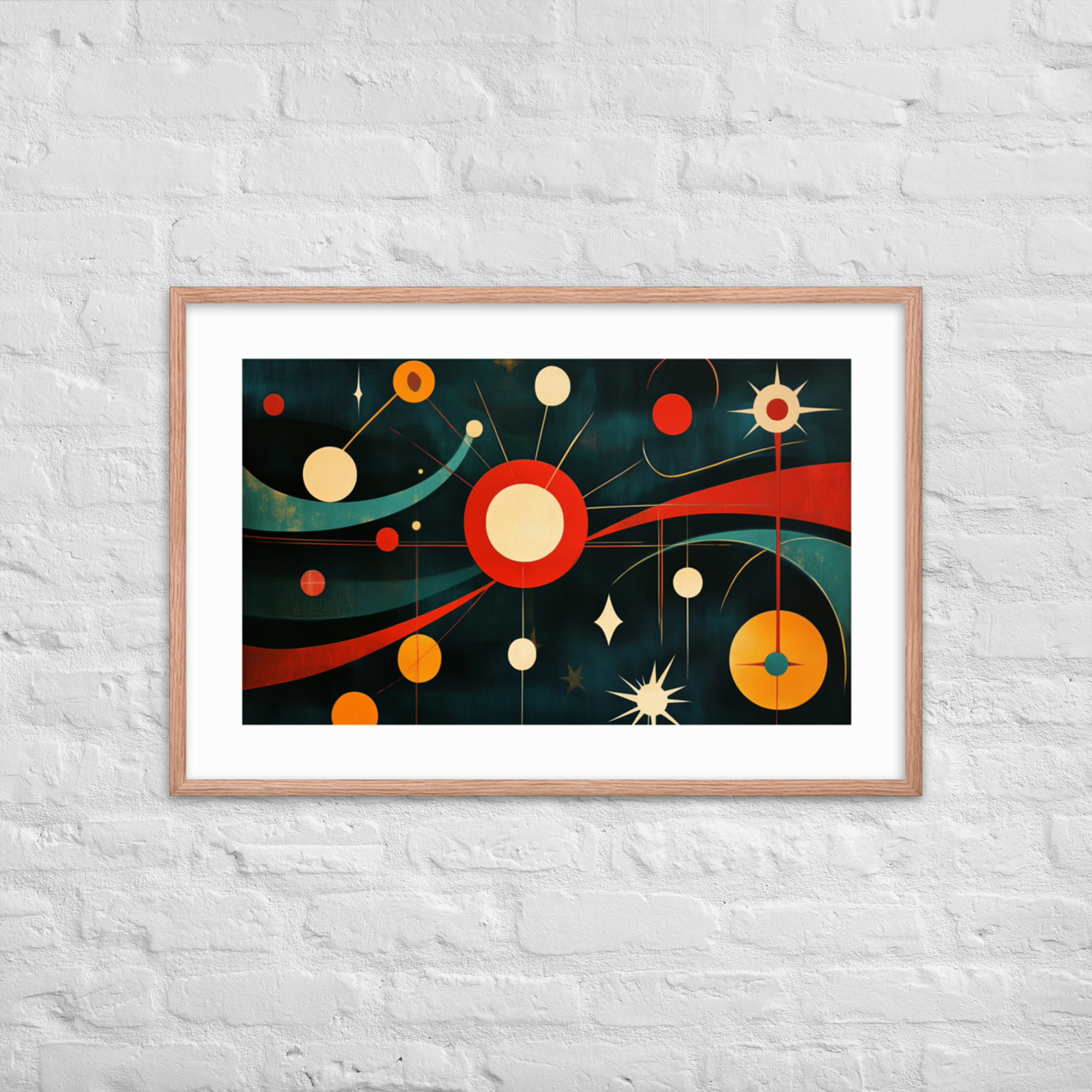
Mid-century modern interior design is one of the most extensively documented and widely imitated movements in the history of residential design, and also one of the most frequently misunderstood. It is often reduced to a checklist: teak credenza, Eames chair, starburst clock. This list is not wrong, but it mistakes the surface of the movement for its logic. Mid-century modern interior design is not a collection of objects. It is a set of principles about how objects should relate to each other and to the space they occupy, and understanding those principles is what separates a room that happens to contain mid-century furniture from a room that embodies the MCM interior tradition.
This guide covers those principles and how to apply them, with particular attention to the role wall art plays in the MCM interior. Wall art is a dimension often overlooked in furniture-focused treatments of the style, but it is central to the movement’s visual program and to what the MCM interior looks like as a complete environment. For context on the movement’s historical origins, visit our design history post. For an overview of how MCM prints fit the interior program, start with The Complete Guide to Mid-Century Modern Art Prints.
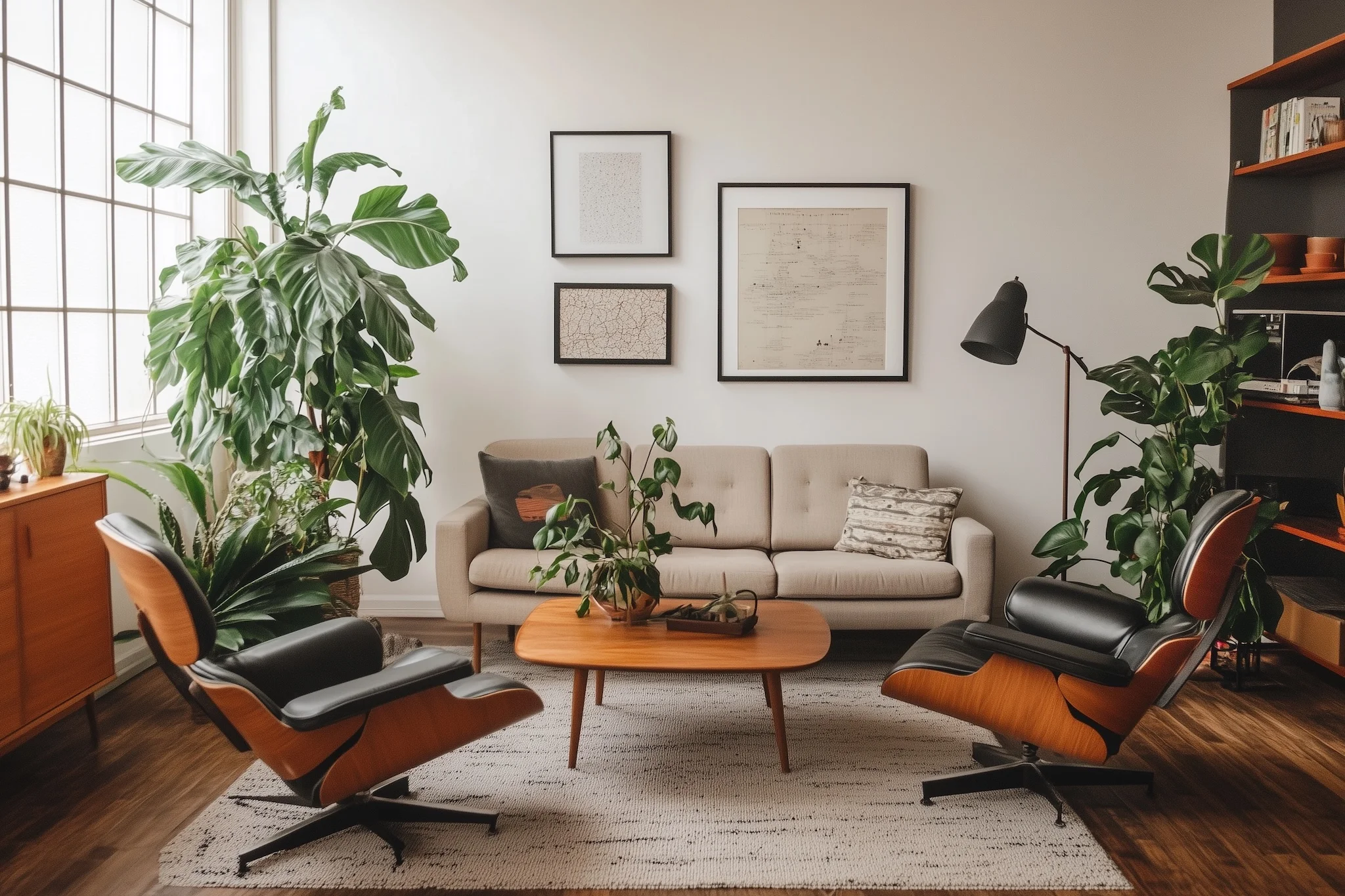
The Principles of Mid-Century Modern Interior Design
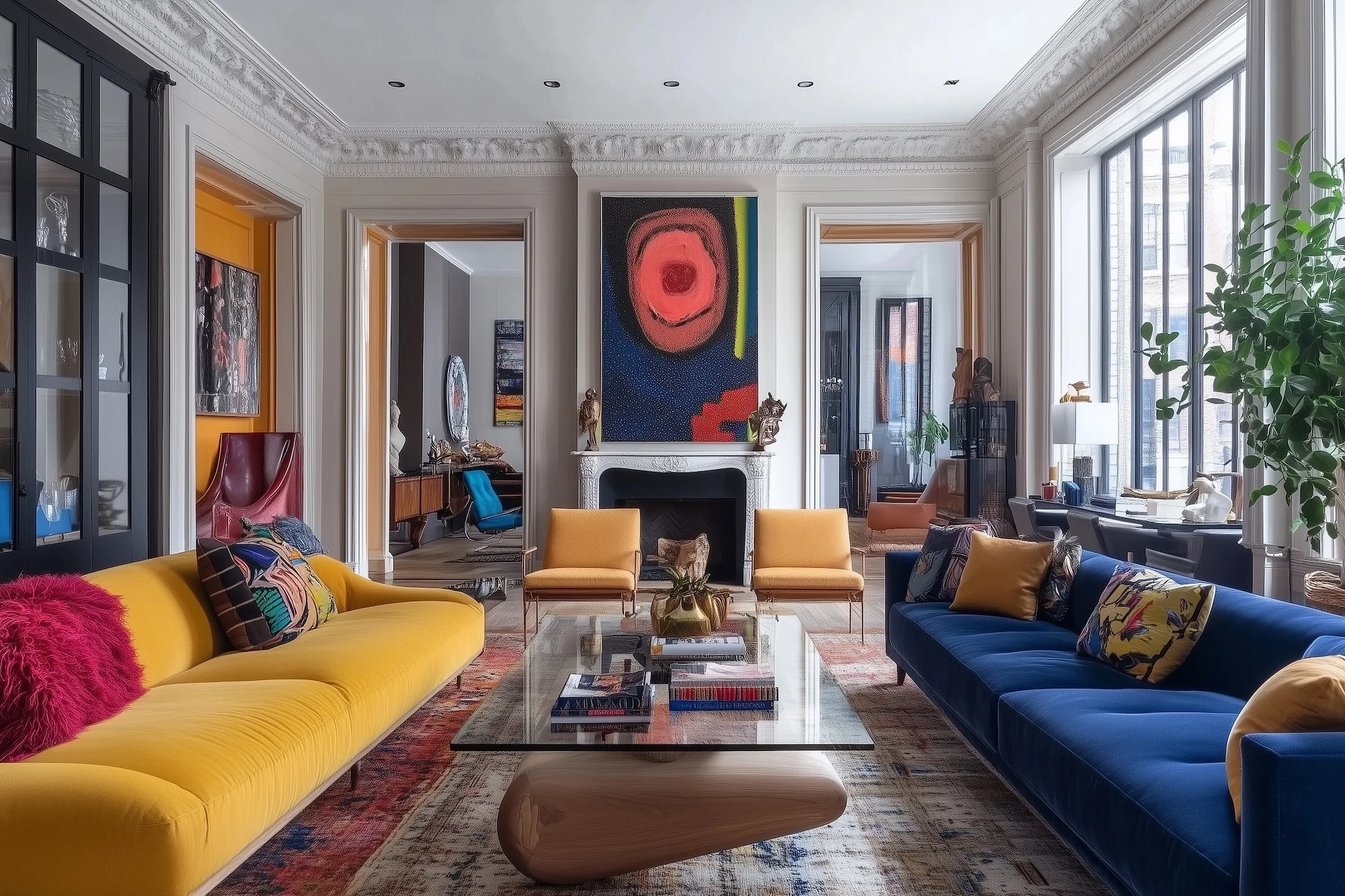
Three principles underpin the MCM interior: functionalism, integration, and material honesty.
Functionalism means that form follows function. Objects exist to serve a purpose, and that purpose should be evident in the object’s form. An MCM interior is not over-furnished: every piece has a role, and pieces without roles do not earn their place. The result is rooms that feel spacious without being empty, because the furniture present is purposeful rather than decorative. This principle also governs negative space: the wall between two pieces of furniture is not a gap to fill, it is breathing room the room needs, and treating it as waste to be covered is a common error that produces cluttered-looking MCM interiors.
Integration means that the room’s elements relate to each other rather than coexisting independently. An MCM interior is designed as a whole: the furniture, the materials, the color palette, and the wall art are in dialogue. Coherence is not matching, where every piece comes from the same collection or period. It is purposeful relation, where the choices present reinforce each other’s logic. A room that integrates well has pieces from different sources and periods that nonetheless read as belonging to the same design conversation.
Material honesty means that materials are used as what they are. Walnut looks like walnut, not like a painted imitation of walnut. Aluminum looks like aluminum. Ceramic looks like ceramic. The surfaces of an MCM interior reveal their own nature, and the finishes that work within the tradition are those that do not pretend to be something other than what they are.
Color Palette: From Muted Neutrals to Saturated Accent Hues
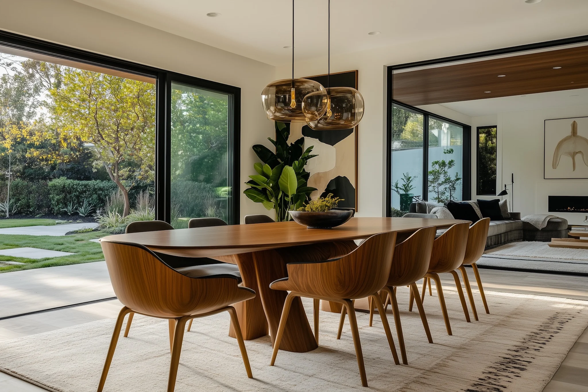
The MCM color palette is not monochromatic, but it is disciplined. The foundation is a neutral ground: white, warm white, or the light cream that warm-spectrum lighting casts on white walls. Against this neutral ground, accent colors are introduced at specific saturation levels: high enough to register across a room, controlled enough not to overwhelm.
The saturated accents of the MCM palette are specific: avocado green, warm mustard yellow, burnt orange, terracotta, slate blue, and the burgundy-adjacent tones of a saturated cranberry. These are not the bright primaries of Pop Art. They are the tones of natural pigments at high concentration, warm and earthy rather than electric or synthetic. The palette is confident but never strident.
The neutral palette includes walnut brown, which appears in furniture and wooden frames as the dominant warm neutral, and the grey-green of slate and certain ceramic glazes. Against a warm neutral ground, these materials read as grounded and settled. Against a cooler white, they read as earthy and deliberate.
The practical approach: start with the floor and the largest furniture piece. If the dominant tonality of those elements is warm, build the accent palette in warm tones: terracotta, mustard, warm sage. If cool, build in cooler accents: slate, muted blue-green, charcoal. The wall color is the field that holds all of it: warm white for warm rooms, slightly cooler white for cool rooms. Wall art enters this palette as an accent element rather than a neutral one, which is why the color story of a print matters as much as its subject. Our color story guide covers how the Black Ink and Red Oak color stories at Mid Mod Style interact with different room palettes.
Furniture as Foundation: Clean Lines, Tapered Legs, Natural Materials
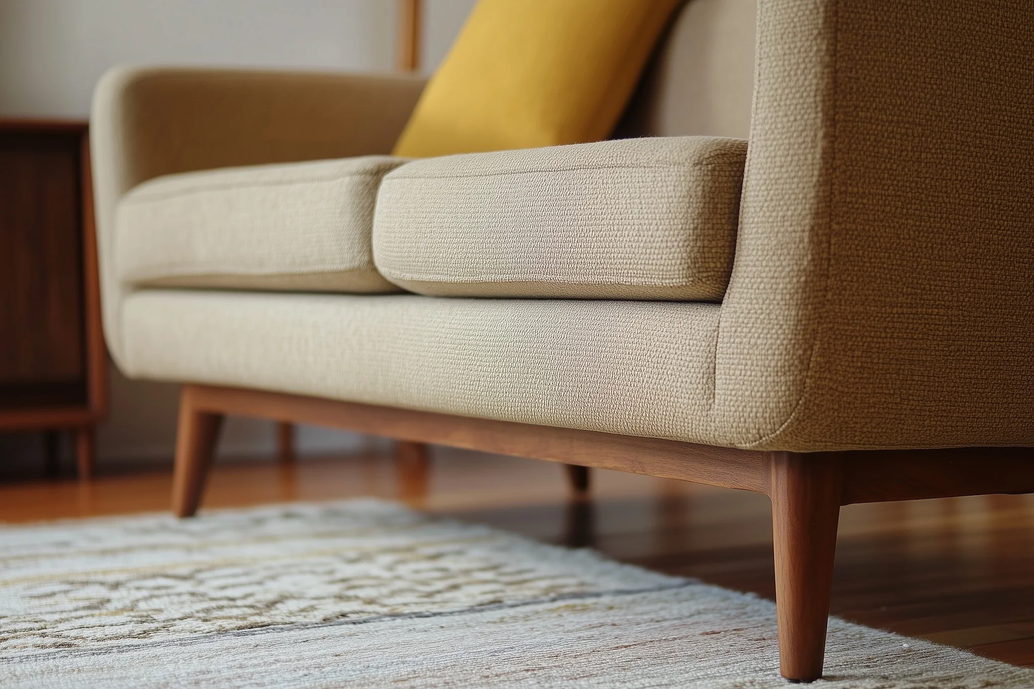
The furniture pieces most associated with MCM design, the Eames plywood chair, the tulip base table, the credenza with tapered or hairpin legs, all share recognizable characteristics. They are low-profile relative to room height, which keeps ceilings apparent and rooms from feeling over-furnished. They have clean, uninterrupted silhouettes: no applied ornament, no carved detail, no hardware that draws the eye away from the form. They use natural materials honestly: wood grain is visible, metal is polished or matte rather than painted, upholstery covers the seat rather than encasing the entire frame.
For buyers working with furniture they already own, the MCM interior does not require wholesale replacement. It requires identifying what is consistent with the principles above and what is in conflict with them. A contemporary sofa with a clean profile and tight upholstery is consistent with MCM principles, even if it was made last year and has no connection to the period. A Victorian armchair with carved wooden arms is in fundamental conflict, and no amount of surrounding MCM objects will make the two read as part of the same design conversation.
The furniture pieces that make the most significant difference in establishing the MCM interior atmosphere, in order of visual impact: the primary seating piece, the floor material or dominant rug, and the main storage unit or shelving. These are the high-value interventions where design consistency matters most. Everything else, including wall art, adjusts to what these three elements establish and amplifies the visual logic they create.
Wall Art as Design Element: Why Prints Are as Important as the Sofa
The standard treatment of MCM interior design focuses almost entirely on furniture and materials. Wall art appears, when it appears at all, as a finishing touch: something to add once the real design decisions have been made. This is a misreading of how mid-century designers actually approached the interior.
The designers most associated with the MCM movement were deeply engaged with graphics, print, and two-dimensional design as primary disciplines, not as adjuncts to furniture. Charles Eames designed exhibitions, films, and graphic communications alongside chairs and tables. The textile designs of Alexander Girard, produced for Herman Miller from the mid-1950s onward, were central to what the MCM interior looked like, not peripheral to it. The graphic quality of MCM design, its bold silhouettes, its use of flat color and sophisticated composition, is expressed in two-dimensional work in ways that furniture, three-dimensional by necessity, can only gesture toward.
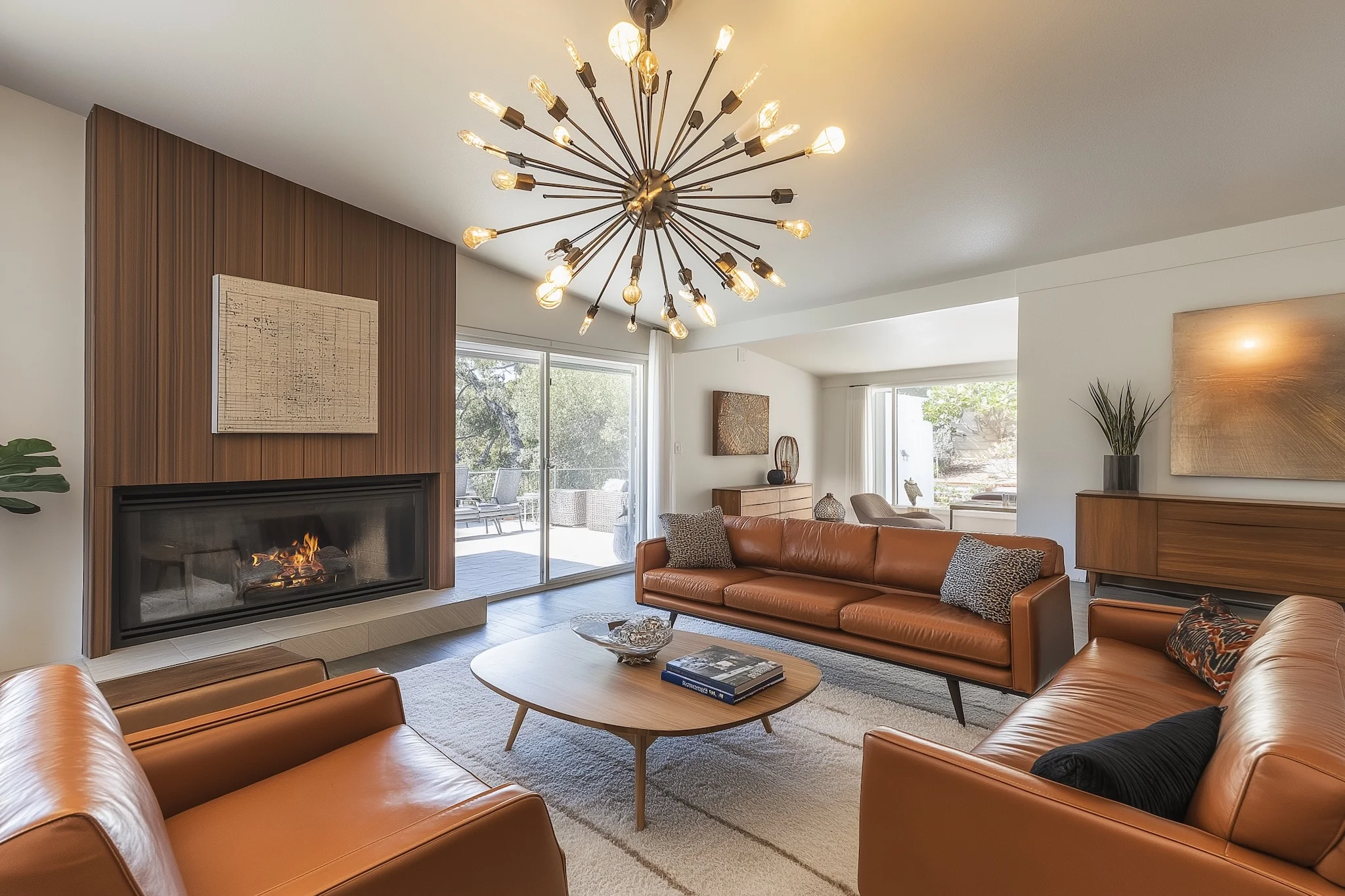
Wall art in a MCM interior does not decorate in the sense of adding surface interest to a finished room. It contributes a dimension of graphic expression that furniture cannot supply. A well-chosen art print above a clean-lined credenza completes the visual logic of that wall. The horizontal line of the credenza, the vertical field of the wall behind it, and the visual weight and graphic quality of the print above it form a composition that does not fully exist without the print.
The selection principles for MCM wall art follow the same logic as for furniture: restraint in composition, honesty in visual language, clarity of subject. Starburst geometric prints express the atomic-age optimism of the era. Botanical prints express its interest in organic form and the natural world as design subject matter. Architecture prints pay direct homage to the built environment the movement produced. Pop art portraits bring human presence and graphic boldness into the design vocabulary.
For a room-by-room guide to placing MCM prints throughout the home, visit our room-by-room decorating guide. For guidance on framing choices that complement MCM prints correctly, visit our framing guide.
Putting It Together: The MCM Interior Checklist
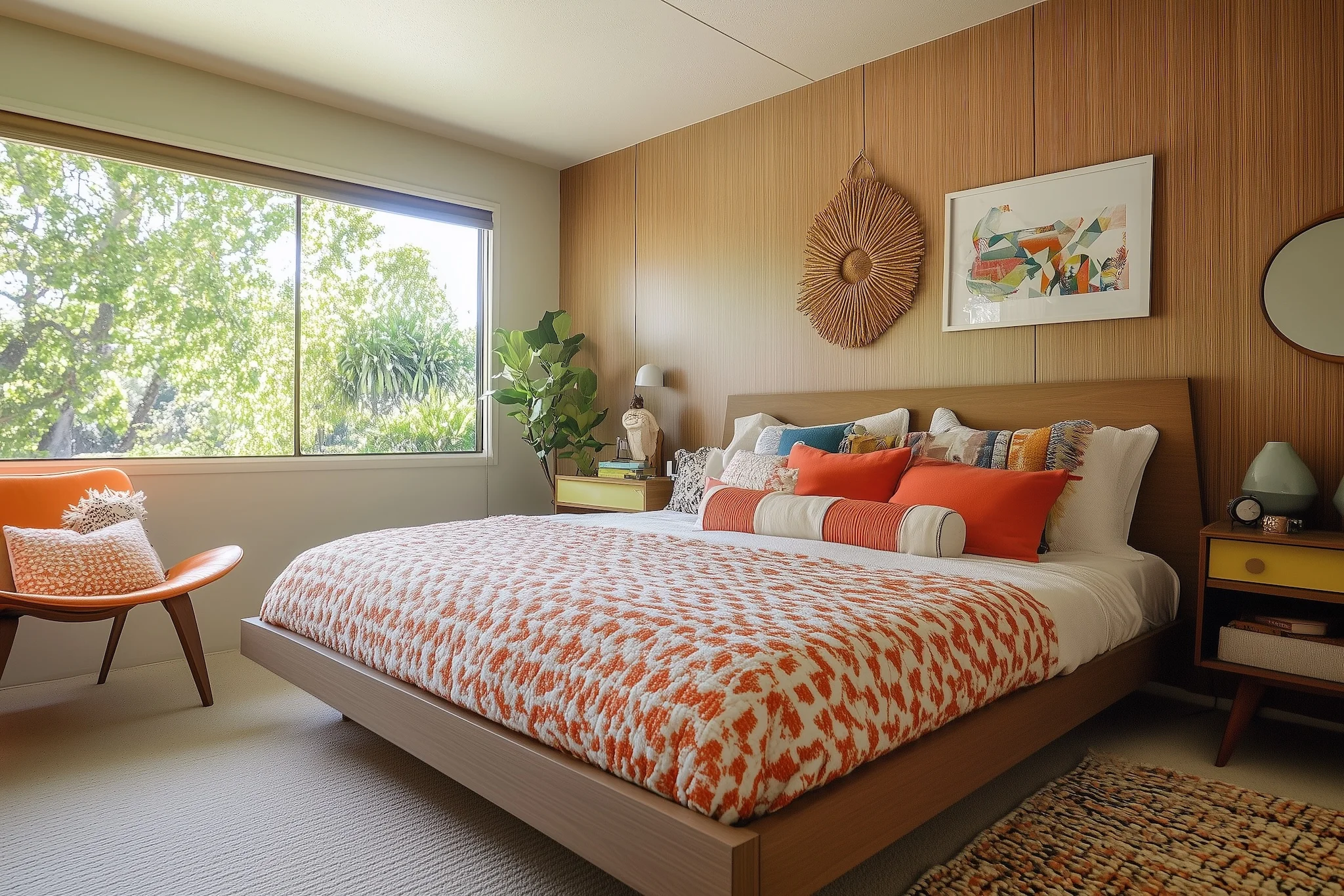
Interior design checklists are shortcuts, and shortcuts have limits. The MCM interior is a set of principles applied with judgment, not a formula applied mechanically. That said, a working checklist:
Palette: Establish a neutral ground and two or three accent colors. Decide whether the room reads warm or cool and hold that temperature consistently throughout the space.
Furniture: Low profile. Tapered or hairpin legs on wood pieces. Clean upholstery line with minimal pattern. No carved detail or applied ornament. Natural materials used honestly.
Floor: Natural wood, polished concrete, or a low-pile rug in a pattern consistent with the MCM vocabulary: geometric, striped, or solid block color. Avoid ornate Persian or floral patterns, which belong to a different design tradition.
Lighting: A combination of ambient and directional. Mid-century modern lighting fixtures, a floor lamp with a tapered profile, a pendant with a simple ceramic or metal shade, are themselves designed objects meant to be seen. If distinctive period-appropriate lighting is not possible, a directional floor lamp combined with recessed ambient lighting is a serviceable alternative.
Wall art: One anchor piece or a planned gallery arrangement. Bold, graphic prints in the MCM tradition. Framed in thin metal or natural walnut with a matte or satin finish. No ornate frames, no decorative mounts, no unframed canvas with heavy texture applied to the surface.
Textiles: Upholstery in a single solid tone or in a period-appropriate pattern such as a geometric or abstract stripe. Cushions and throws as controlled accents, not as the room’s primary color vehicles.
The principle that holds all of these together: everything present has a reason to be there, and nothing present is trying to be something it is not.
Common Styling Mistakes and How to Avoid Them

Three mistakes appear most consistently in MCM interiors, and all three are correctable without starting over.
Over-furnishing is the most common. The MCM interior is not about filling a room: it is about selecting what belongs in it. A room that feels crowded with too many pieces, even good pieces, does not read as mid-century modern because the style’s visual logic depends on negative space. Remove a piece and see whether the room improves. It usually does.
Scale mismatch is the second. A small print on a large wall, or a large print in a small room, pulls the room’s proportions in the wrong direction. The size relationship between a print and its wall matters as much as the print’s subject or color story. Our size guide addresses this directly with specific measurements and wall-size recommendations.
Mixing too many eras is the third. An MCM interior with Victorian side tables and a Baroque mirror will read as eclectic at best and confused at worst. The MCM aesthetic has room for contemporary pieces that share its principles: clean lines, natural materials, functional forms. What it does not have room for is ornament from traditions with opposite values. The cleaner the design vocabulary, the more confidently the MCM intention reads.
Start with the Walls: Explore the Mid Mod Style Print Collections
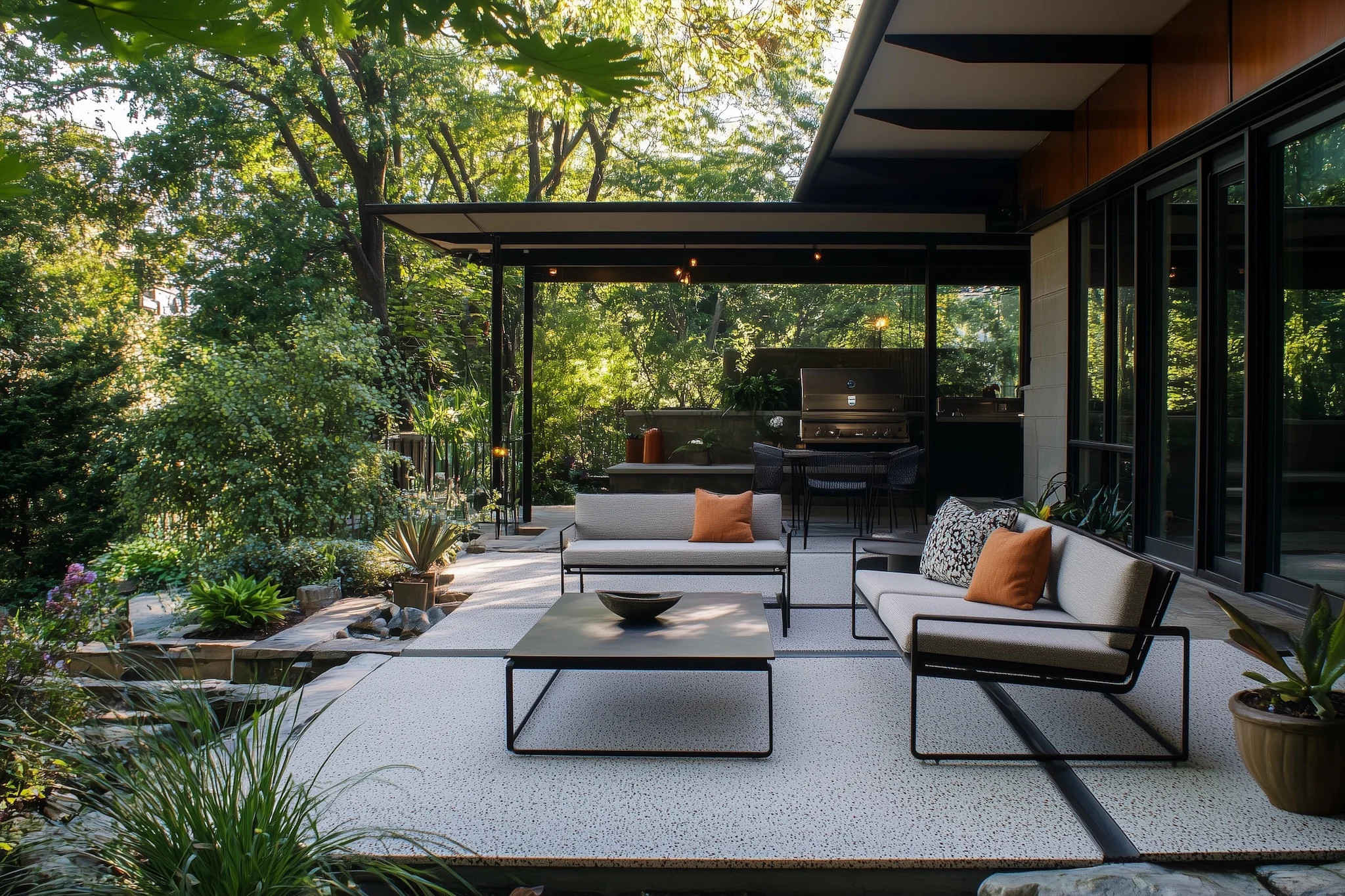
For most buyers, the most achievable first step toward a MCM interior is not the furniture: it is the wall. Wall art is accessible, reversible, and has an outsized visual effect relative to its cost and effort. A single well-chosen print above a credenza or sofa transforms the character of a wall and anchors the room’s visual logic in a way that no single furniture piece can achieve in isolation.
We offer prints in our two color stories, Black Ink and Red Oak, across formats that fit every wall: gallery arrangements starting at 12×18, mid-size statement pieces at 18×24, and large-format focal-wall prints at 24×36. The full catalog is organized by collection, making it possible to browse by subject and color story and understand how each collection contributes to the MCM interior program before committing to a specific print. Browse at our shop and start with the collection that most closely matches the visual logic already present in your room. For a guide to making that match, visit The Complete Guide to Mid-Century Modern Art Prints.