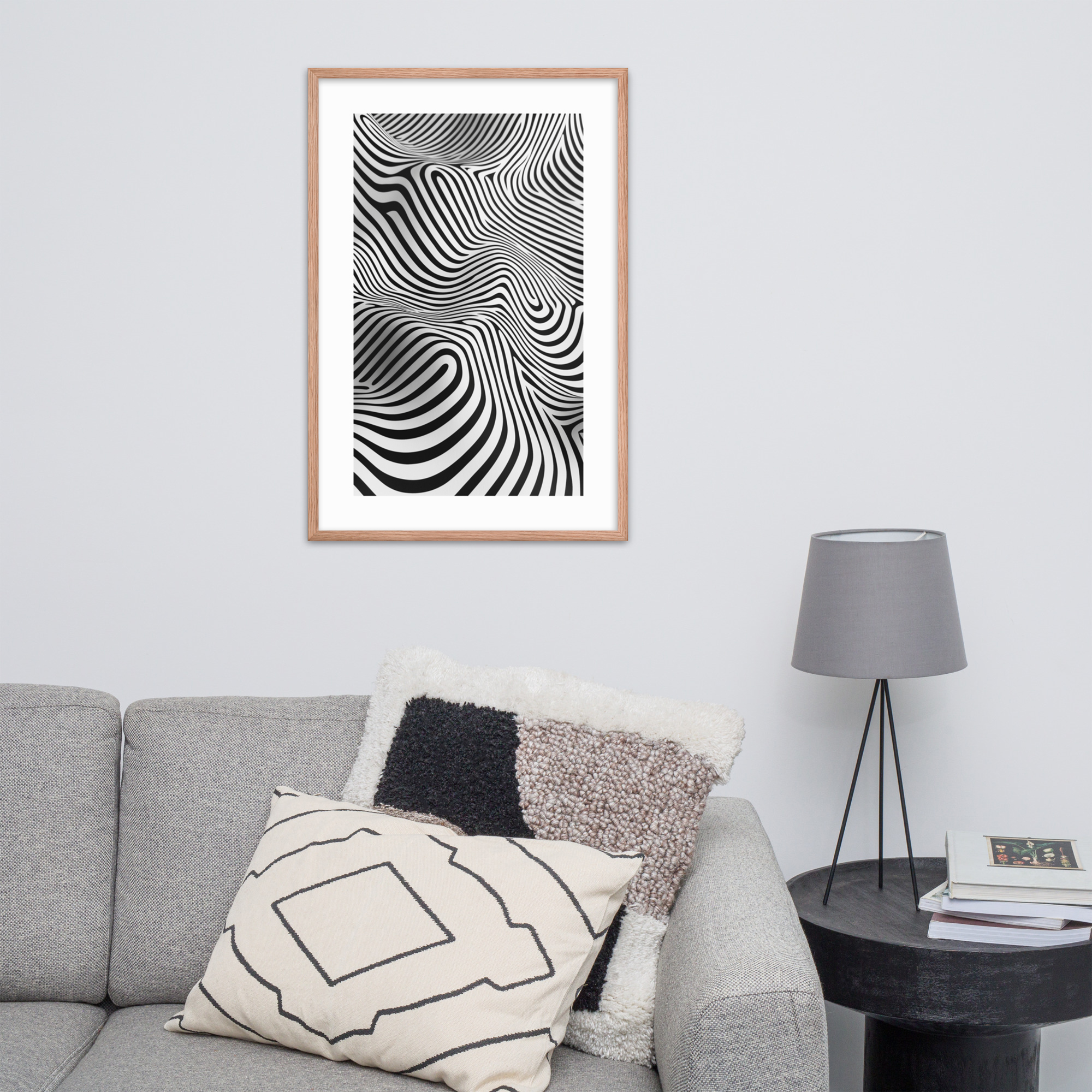
Mid-century modern living room art is where the MCM look either holds together or falls apart. A well-chosen print above the sofa anchors the entire room. A print that is wrong in scale, tone, or style makes the furniture around it look uncertain. This guide covers how to choose an anchor print for a mid-century living room, how to size it correctly, which collections from our catalog work best in this space, and how to think about the color story.
For a broader introduction, see our Complete Guide to Mid-Century Modern Art Prints or the full Room-by-Room Decorating Guide.
The Living Room as the MCM Showcase
The mid-century modern interior was designed around the living room as the room that most fully expressed the aesthetic. The Eames lounge chair belongs in a living room. The low credenza with clean legs belongs in a living room. And the art, whether a large abstract print or a graphic botanical composition, belongs on the wall above, beside, or across from the furniture that defines the space.
This made the living room the room most likely to contain the home’s most important piece of art. In the 1950s and 1960s that might have been an original painting or a museum poster. Today, a high-quality art print in the right composition and size can serve exactly the same function.
The standard for living room art in the MCM interior is this: it should be large enough to anchor the wall, graphic enough to read from across the room, and interesting enough to hold up to daily looking. A print that only works up close is not quite right for a living room wall.
Anchor Prints: How to Choose a Focal Point for Your Living Room Wall
An anchor print in a living room context is a piece that defines its wall rather than decorating it. The difference is scale and visual weight. A 12×18 print centered on a 10-foot wall decorates the wall. A 24×36 print, or a pair of 18×24 prints, anchors it.
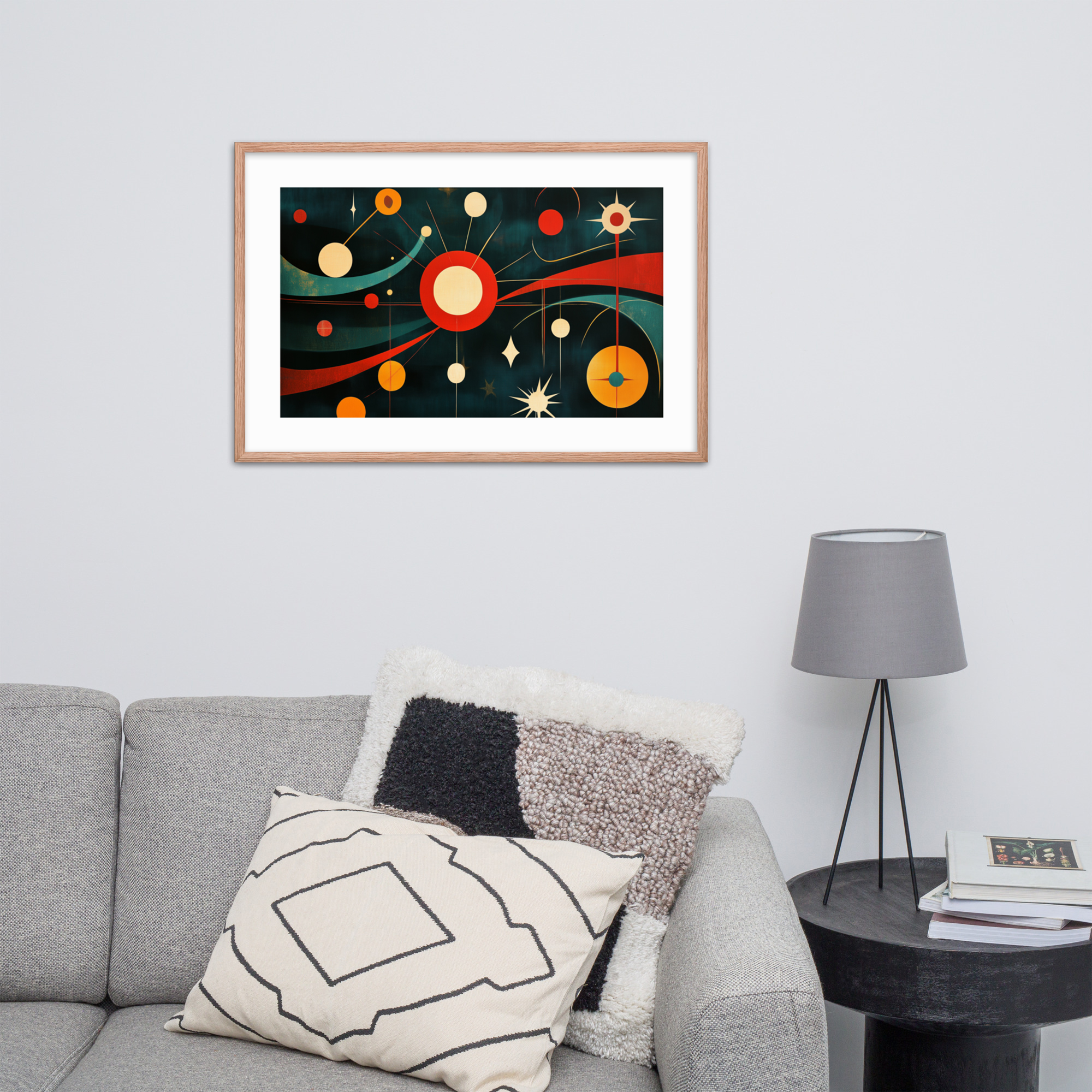
The primary anchor point in most living rooms is the wall above the sofa. The secondary anchor point, if the room layout allows it, is the wall opposite the primary seating. Both of these positions call for the same thing: visual weight that holds attention without requiring you to walk up to the art to appreciate it.
For the wall above the sofa, the proportion rule is simple: your art should span roughly 60 to 75 percent of the sofa’s width. Above an 84-inch sofa, that is roughly 50 to 63 inches of art width. A single 24×36 print at 24 inches is narrower than this range. Two 18×24 prints hung side by side, with a few inches between them, gets you to roughly 40 to 42 inches, which works above a shorter sofa. For a standard or large sofa, a 24×36 plus a 12×18 grouping, or three prints in a row, is often the right answer.
See the Art Print Size Guide for precise sizing by wall and furniture dimensions.
Size Matters Most in the Living Room
Of all the rooms in a mid-century modern home, the living room is the one where sizing errors are most visible. A print that is too small for a living room wall creates a visual awkwardness that every visitor notices, even if they cannot name it. The art looks as if it were placed there temporarily.
The sizing question is also the most important one to resolve before placing an order. Measure the wall width, measure the sofa width, and use the 60-75 percent rule. If you are considering a gallery arrangement, measure the total arrangement width the same way.
For the living room, our 24×36 is the right starting point for primary walls. The 18×24 is appropriate for secondary walls, above a console or sideboard, or as part of a multi-print arrangement. The 12×18 belongs in the living room only as part of a gallery wall grouping, not as a standalone piece on a primary wall.
Collection Pairings for MCM Living Rooms
Not all collections work equally well in the living room as anchor prints. Here is how we think about the primary collections for this space.
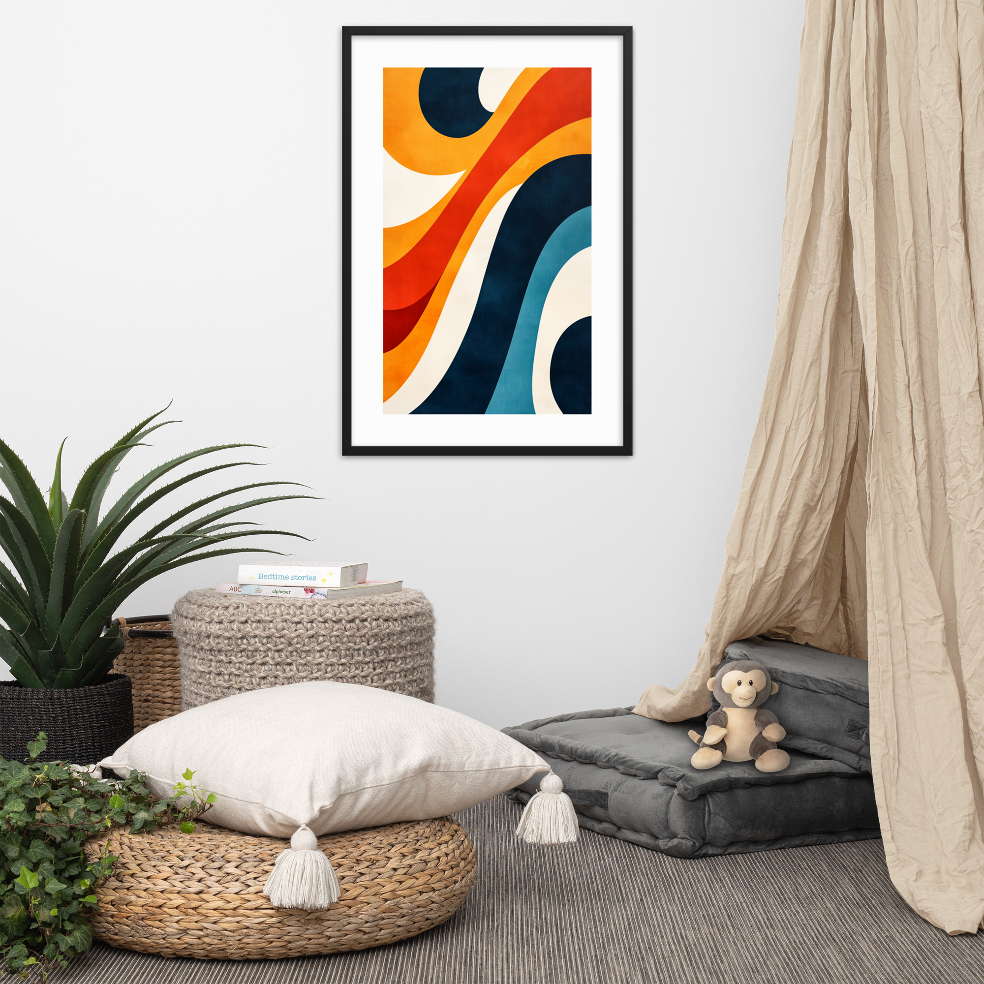
Geometric and Abstract is the strongest anchor choice for most MCM living rooms. The bold graphic compositions in this collection carry enough visual weight to hold a large wall without furniture crowding them. The starburst and op art patterns are also the most identifiably mid-century, which helps the print signal the room’s aesthetic clearly. Read more about the collection in our Geometric Art Prints Guide.
Mid-Century Architecture prints work especially well in rooms where the furniture skews toward the California Modernism aesthetic: low-slung profiles, teak or walnut, indoor-outdoor orientation. The architecture prints in this collection celebrate exactly that kind of home. See our Architecture Prints Guide for the full collection.
Pop Art and Portraits bring a human presence into the living room that the more abstract collections do not. If you want art that makes guests want to ask about it, the portrait prints in this collection are typically the ones that start conversations.
For a room where you want calm, the Landscape and Botanical collections are options, but they tend to work better in bedrooms and dining rooms. The living room is usually the right room for something with more graphic presence.
Black Ink or Red Oak for the Living Room
Living rooms in mid-century modern homes come in two broad flavors: the light, bright version with white walls and pale wood, and the warmer version with rich walnut, amber textiles, and deeper wall colors. The colorway decision in our catalog maps directly onto this split.
Black Ink is the right choice for light, bright living rooms. The high-contrast compositions in this colorway read cleanly against white and off-white walls, and the crispness of the black ink preserves graphic details that a warmer palette would soften.
Red Oak suits the warmer living room: amber-toned walls, walnut furniture, the kind of room that leans into the California Modernism palette. The Red Oak colorway adds warmth to every composition in the catalog.
Read more about how to decide between the two in our full Color Story Guide.
Shop Prints for the Living Room
Three prints from our catalog that work particularly well as living room anchors:
Retro Living Room Dreams from the Architecture collection depicts a mid-century interior in warm tones: a natural choice for a living room that wants to celebrate the era’s domestic aesthetic directly.
Mid-Century Op Art Mesmerizer from the Geometric collection is a bold optical pattern that holds a large wall and reads from across a room. This is the kind of anchor print that makes a living room look intentional.
Vibrant Martini Sunset is a cocktail-hour composition that brings jewel-toned graphic energy appropriate for a living room meant to feel like a place for gathering rather than a room you pass through.
All prints are made to order, available in both Black Ink and Red Oak colorways, and in all three sizes. Browse the full collection in our MCM Art Prints Guide or head directly to the shop.