

There is a building in Holmdel, New Jersey, designed by Eero Saarinen and completed in 1962. It was built as a research campus for Bell Labs, the organization whose laboratories produced the transistor, the solar cell, and information theory. It has a central atrium the length of a city block, bands of floor-to-ceiling glass, and the kind of scale that is intended to communicate something about the ambitions of the organization that owns it. It is, by any architectural measure, a great building. It is also the interior of Lumon Industries.
The television series Severance, which premiered on Apple TV+ in 2022, uses this building as its central character. The show is about office workers whose memories are surgically severed between work and home life, so the people they are at the office have no knowledge of anything outside it. The design choice is not incidental. Production designer Jeremy Hindle did not pick this building as a stand-in for a generic corporate environment. He picked it because it makes a specific argument about a specific era, and Severance is a show about what happens when the promises of that era are taken to their logical end.
A Building With a Point of View
Bell Works, as the building is now known, was designed at the apex of corporate modernism in American architecture. Saarinen, the Finnish-American architect responsible for the TWA Terminal at JFK and the Gateway Arch in St. Louis, was working in a tradition that believed explicitly in the connection between great design and human flourishing. The open atrium at Bell Labs was not a stylistic gesture. It was a statement that research happens better when researchers can see each other, when the institution is transparent about its own activity, when the building encourages movement and encounter rather than isolation.
The interior of Lumon Industries inverts this precisely. The windows in the Lumon offices look out from the inside only to other interior corridors. The atrium that should be the communal heart of the building is, in the show, a place of surveillance and ritual. The corridors are long, undifferentiated, and navigated by color-coded wayfinding that the workers follow without fully understanding. The building was designed to liberate. The show asks what happens when that same design is turned toward control.
What Jeremy Hindle Was Building
Hindle has described the central challenge in interviews about the show: the production design needed viewers to be unable to place it in time, so the world would read as neither period piece nor contemporary nor future. By his account, the lamps and chairs were deliberately manufactured or sourced from far afield, so that nothing on screen would register as a recognizable icon like an Eames chair. The ambiguity was the goal.
This is a precise design decision. An Eames chair would anchor the room in a specific decade (the 1950s or 60s) and a specific cultural moment (the postwar American design optimism that produced the Eames chair alongside the Stahl House and the Case Study House Program). It would tell the viewer: this is a period piece, or a nostalgia piece, or an homage. Hindle wanted none of those readings. He wanted the room to feel like it could be 1965 or 2065, a past we half-remember or a future that never quite arrived.
The furniture, as a result, is anonymously period. The shapes are consistent with mid-century modernism, the low profiles, the warm wood paneling, the specific relationship between a chair and the floor it rests on, but without the brand markings that would give a design historian a fixed date. Set decorator Andrew Baseman curated these pieces for the first season, finding or manufacturing items that have the vocabulary of the era without the identity.
The Specific Design Elements
Look at the MDR office where most of the show’s central action takes place. The ceiling is low. The carpet is a specific shade of industrial warm brown that appears nowhere in contemporary office design but appeared in corporate interiors from the late 1960s onward. The computer monitors and equipment are bulky, boxy, and clearly made, not the product of any one decade’s industrial design, but carrying the weight and deliberateness of mid-century objects rather than the thinness of contemporary ones.
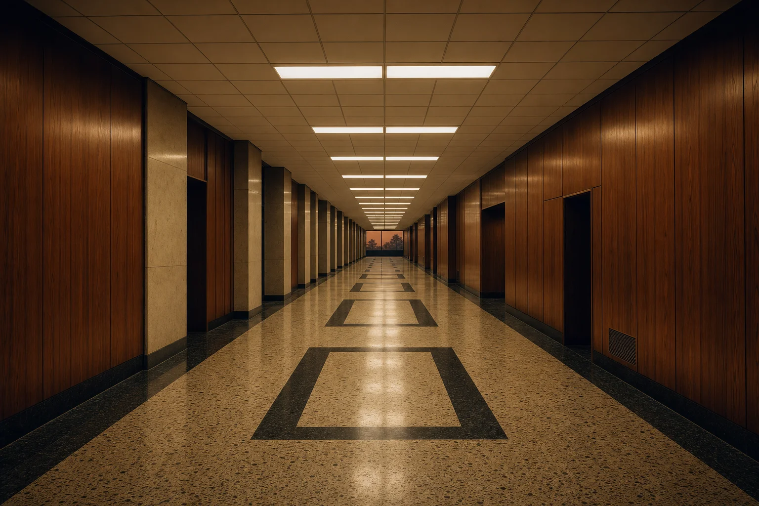
The warm wood paneling used throughout the Lumon interior is a genuine mid-century element, applied with enough consistency to read as period while being positioned in ways that feel slightly wrong. Paneling in 1965 was used to make a room feel domesticated, to bring the warmth of furniture material into the architectural shell. At Lumon, the paneling makes the corridors feel like furniture that got too large. The domestic scale is there but the room is not domestic. The dissonance is the point.
The wayfinding system, the color-coded floors and the handmade directional signs, draws on a tradition of mid-century graphic design without citing any particular example from it. It looks like something a design team in 1968 would have produced for a progressive institution. It also looks like something a controlling institution would use to manage people who do not fully understand where they are going.
Why 1965 in Particular
Severance keeps returning to a specific moment in the mid-century timeline, roughly 1962 to 1968, the years when corporate modernism reached its highest confidence. These are the years of Saarinen’s Bell Labs, of Eero Saarinen and Kevin Roche’s John Deere Headquarters in Illinois, of corporate headquarters buildings that embodied a specific belief about organized human endeavor. The belief was that rational design, applied with enough care and resources, could create conditions in which people worked better, thought more clearly, and were, in some quantifiable sense, improved by their environment.
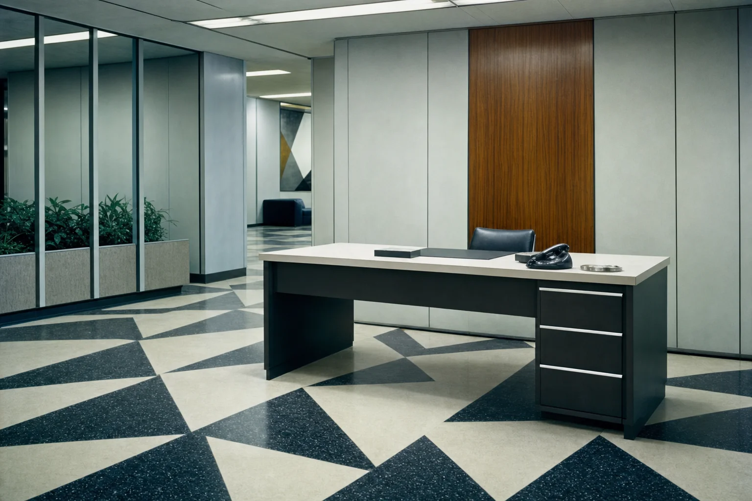
This belief was not cynical in its original articulation. The architects and designers who built these buildings were serious people with serious commitments to what good design could do. The tragedy that Severance is working with is that the belief was coherent and the application was sometimes genuine, and still the system it enabled could be turned toward ends that had nothing to do with human flourishing.
The decade is specific because it is the decade before this became obvious. 1965 was before the environmental impact of industrial modernism became impossible to ignore, before the corporate campus became a cliche, before the promise of rational organization became associated with its costs. Severance is set at the moment the promise was still intact, which is when it is most useful to examine what the promise was actually promising.
What the Show Does for the Aesthetic
Mad Men used mid-century modernism as a vehicle for nostalgia and seduction: the furniture is beautiful, the cocktails are elegant, and the moral rot underneath is revealed slowly. The design is something you want to step into even as the show makes clear you should not. Severance uses the same design vocabulary for something different: the furniture is ambiguously beautiful, the corridors are clean and frightening, and the rot is structural rather than personal. It is not about people making bad choices in good rooms. It is about what rooms can do to people.
The effect on the aesthetic is interesting. The show has introduced a generation of viewers to the visual language of late corporate modernism, the warm wood panels, the wayfinding systems, the specific relationship between horizontal planes and the human body, while loading that language with dread. Whether this makes the look more or less appealing is a genuinely open question. The sets are beautiful. The show is frightening. Both are true at the same time.
The design vocabulary that Hindle worked with is the same vocabulary that the era’s best print designers were using: clean geometry, specific color relationships, the confidence to let a shape be exactly what it is. The Space Age collection and the Geometric Abstract collection work from exactly this material, in contexts that do not require the dread to make them interesting.
There is a lesson in Hindle’s method for anyone furnishing a real room. He built a convincing mid-century world without a single dated original in it, by keeping the vocabulary of the era, the low profiles, the warm wood, the honest structure, and dropping the provenance. That is the same move that lets a contemporary sofa sit comfortably beside a genuine Eames chair: the era was always a set of ideas about line and light, not a list of objects with the right labels. You can borrow the grammar without buying the antiques. We make the longer version of that argument here.
The corridor with the warm wood paneling is the same material as the starburst on the wall. The difference is what surrounds it, and what is asked of it, and whether the room gives you somewhere to go.