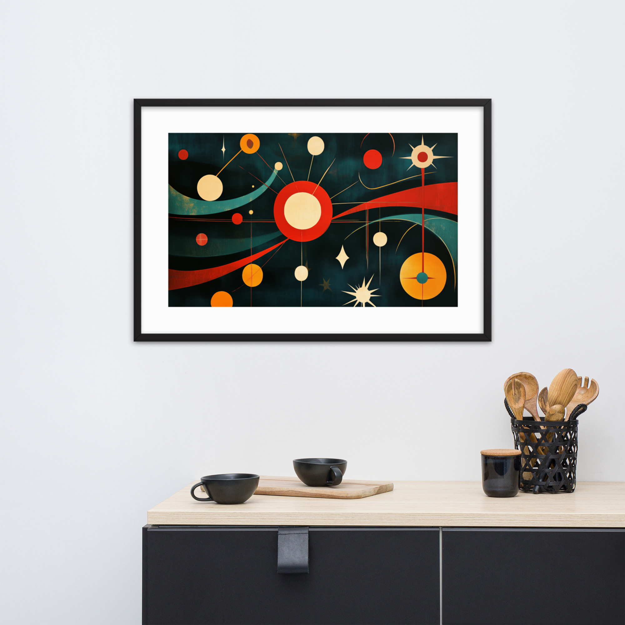
How to decorate mid-century modern style is one of the most searched home decor questions online, and the answer always involves a few recurring elements: clean-lined furniture in warm wood, graphic textiles, and art that understands restraint. What this guide adds to that conversation is the wall art perspective. Specifically: which mid-century modern art prints belong in which room, how to position them, and how to make art and furniture work together rather than compete. We have organized the guide by room, with specific collection recommendations and product examples for each space.
For a broader introduction to the prints themselves, read our Complete Guide to Mid-Century Modern Art Prints.
The Role of Wall Art in a Mid-Century Modern Interior
The mid-century modern interior is not minimal in the way that post-2010 minimalism is minimal. It is not about empty walls. The era’s interiors typically had art on the walls, textiles on the floors, and color everywhere from the curtains to the upholstery. What the MCM interior avoided was fussiness: no matching print sets, no decorative borders, no art that looked like it was chosen for how well it matched the sofa.
Art in the mid-century modern home earned its wall space by being genuinely interesting on its own terms. A starburst composition does not need to match your cushions. It needs to be good enough that you want to look at it, and cohesive enough with the room’s broader visual logic that it does not fight what is already there.
The practical implication for buying art: choose prints that belong to the same visual era as your furniture, not prints that try to match specific colors. A jewel-toned geometric print does not need to match your olive-green sofa exactly. It needs to belong to the same design conversation. Mid-century prints work in mid-century rooms because they come from the same aesthetic source, not because they are color-matched.
Living Rooms: Anchor Prints and Statement Walls
The living room is where most people start when adding art to a mid-century modern interior, and for good reason: it is the room with the largest walls and the most clearly defined anchor points.
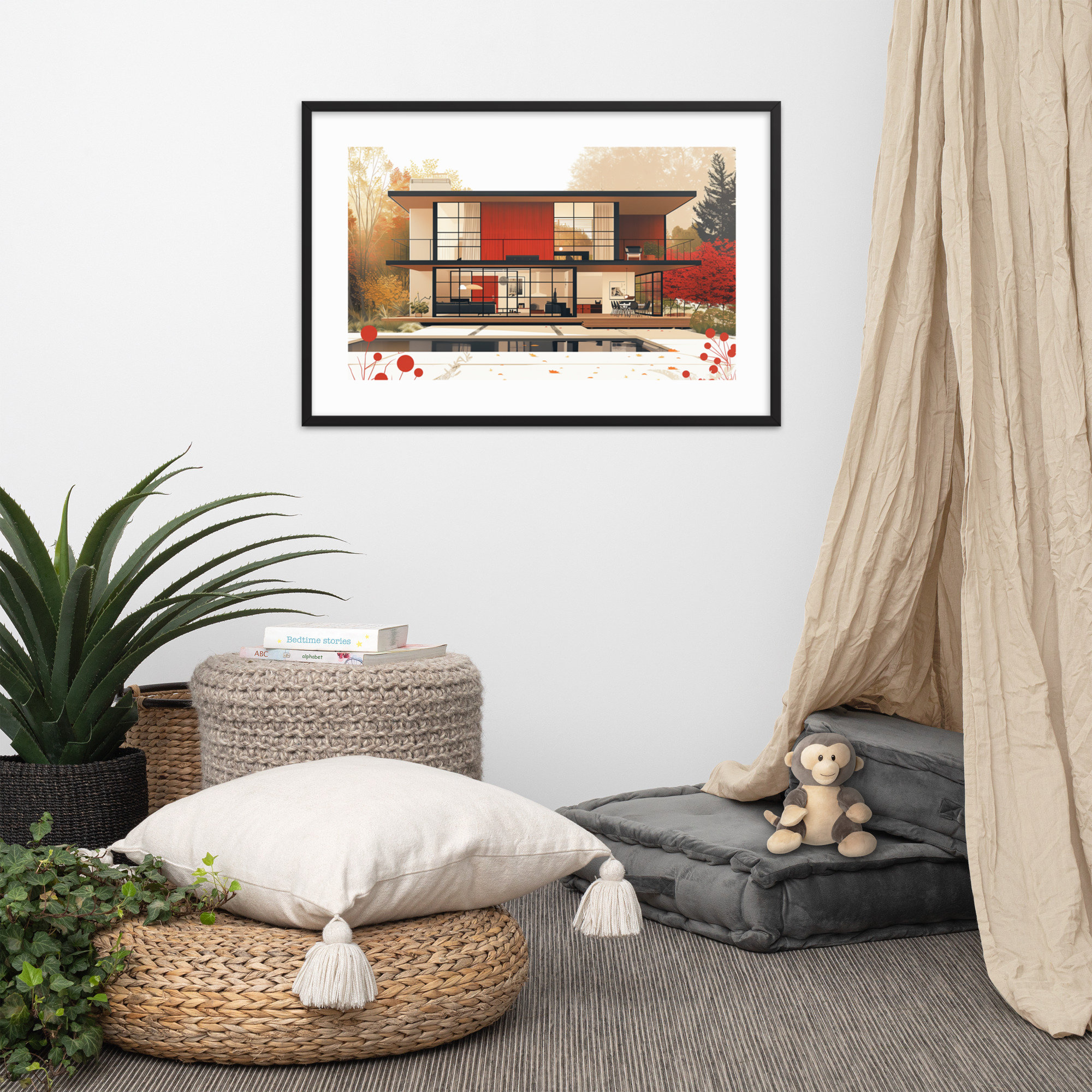
An anchor print is the piece that defines a wall rather than decorating it. In a living room, the primary anchor point is almost always the wall above the sofa. For a standard 3-seat sofa, roughly 84 inches wide, a 24×36 print centered above it establishes a clear focal point. Two 18×24 prints hung side by side above a longer sofa create a different rhythm that works equally well.
The collections that tend to work best as living room anchors: Geometric and Abstract, which are strong enough to hold a large wall without furniture around them; Architecture, whose horizontal compositions work well above a sofa’s long span; and Pop Art, where portrait-scale imagery brings human presence into a large room.
For the full living room guide, including collection pairings and specific product recommendations, see our Mid-Century Modern Living Room Art post.
A print that works particularly well in this context is Retro Living Room Dreams, which depicts a mid-century interior in the Architecture collection’s characteristic warm palette. The image of a room within a room creates a layering effect that works well in living spaces.
Bedrooms: Calm, Graphic, and Grounded
Bedrooms in mid-century modern homes tended to be quieter than living rooms. Less color-saturated, more grounded. Art in the bedroom supports this: it should be interesting without being restless, graphic without being aggressive.
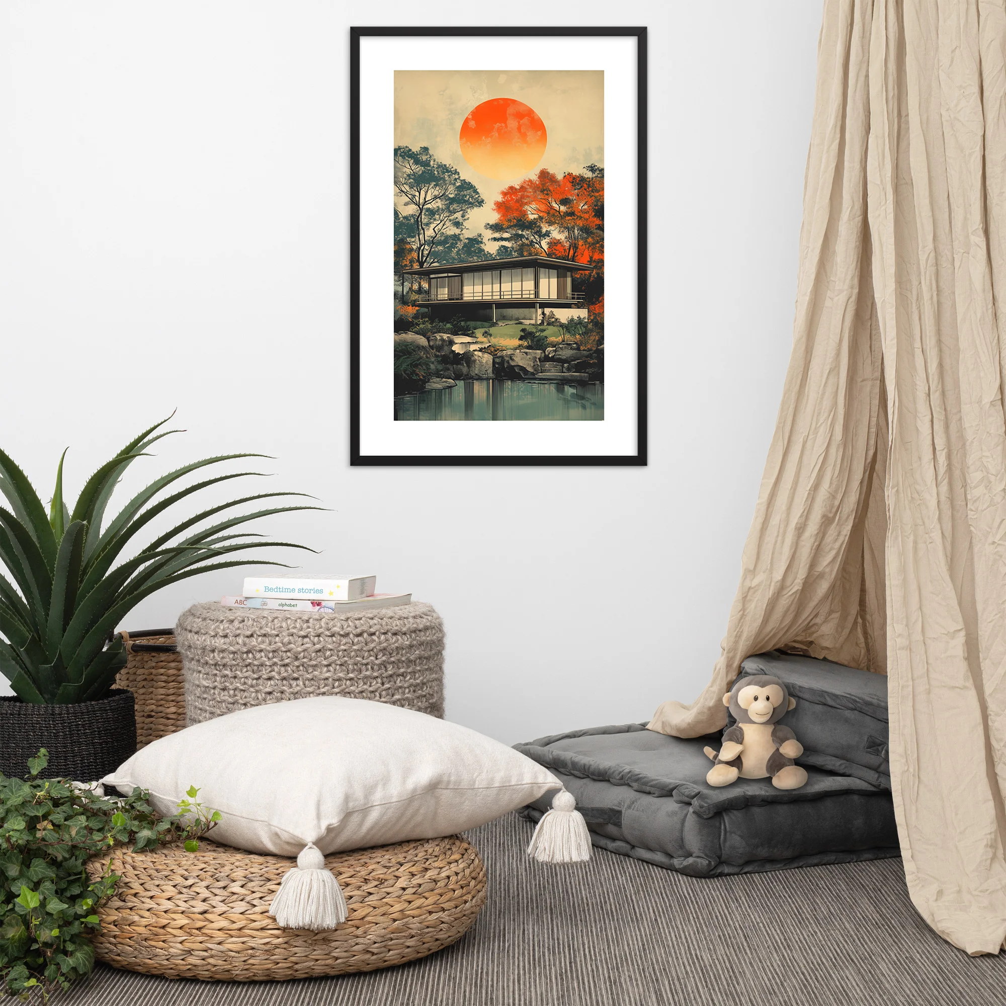
The collections we recommend most consistently for bedrooms are Botanicals and Landscape and Quiet Scenes. Both offer natural imagery that the eye can settle into rather than snap across. A botanical print above the bed in the Black Ink colorway gives you graphic definition without the visual intensity of a starburst. A landscape print in the Red Oak colorway brings warm tones to a room you want to feel like evening.
The most common placement is a single 24×36 centered above the headboard. If your headboard is particularly wide, two 18×24 prints flanking the center work well. Avoid sizes that feel cramped against a king headboard: a 12×18 centered above a king bed looks adrift.
See our full Mid-Century Modern Bedroom Wall Art guide for sizing specifics and more collection recommendations.
One print worth considering here is Monochrome Harmony, from the Geometric collection, which brings structural graphic energy to the bedroom without the kind of bold color that can make a room feel awake rather than restful.
Home Offices: Art That Focuses and Inspires
The home office calls for different art than the living room or bedroom. It is a room where identity and focus intersect, and art in this space tends to reflect both. The MCM era produced plenty of art that fits this context: Space Age prints carry a specific kind of forward-looking energy that suits a working environment, Classic Cars bring a sense of power and forward motion, and bold Geometric compositions read as confident and decisive.
Avoid art that is too serene for this space. The Landscape and Botanical collections work in bedrooms precisely because they are restful. Those qualities become liabilities in a room where you are trying to produce work.
Video call backgrounds are another consideration for the home office. A well-chosen print at the right scale and position can function as a considered, permanent background that communicates design sensibility without trying to be a prop.
For more guidance on home office art placement, including how to balance personal preference with a professional-looking background, see our Home Office Wall Art Guide.
The Color Burst Canvas from the Geometric collection is a strong home office choice: high graphic energy, bold enough to read well at a distance, and identifiably MCM without being a conversation piece that distracts from the work.
Gallery Walls: Mix Without Chaos
A gallery wall in a mid-century modern interior needs to follow the same design discipline as the era itself. It cannot be eclectic in the way a bohemian gallery wall can. The frames should match, or at minimum share a material language. The prints should come from a coherent visual vocabulary, even if they span multiple collections.
The rule we apply: pick two collections maximum for a gallery wall composition. Two Geometric prints alongside two Botanical prints share enough visual logic to cohere. Both are MCM, both are graphic rather than representational in the traditional sense. A Geometric print next to a Classic Car print next to a Landscape print starts to feel restless.
Size consistency helps enormously. A gallery wall of all 18×24 prints in matching black frames reads as controlled and intentional. Mixed sizes can work, but they require a clearer compositional logic: a large central 24×36 flanked by two 12×18 prints on each side, for instance.
For full layout guidance and specific print combinations, see our Gallery Wall Guide.
Getting Size and Scale Right
Every room we have covered in this guide involves a sizing decision, and the wrong size is the most common mistake we see. Art that is too small for its wall looks accidental. Art that is too large fights the furniture around it.
The general principle: your art should occupy 60 to 75 percent of the wall width above the primary furniture piece. Above a 72-inch sofa, that means art between 43 and 54 inches wide. A single 24×36 print at 24 inches wide is narrower than this range, which is why two prints side by side or a larger grouping often works better above a long sofa than a single piece.
For small walls, the math is simpler: a 12×18 or 18×24 print is generally right for wall widths under 36 inches. For walls above 48 inches, move to 24×36 or a multi-print arrangement.
Read the full Art Print Size Guide for precise measurements by room type and furniture dimensions.
Shop All Prints by Room Style
Every print in our catalog is made to order and arrives ready to frame. All three sizes, 12×18, 18×24, and 24×36, are available in both the Black Ink and Red Oak colorways. Browse the full catalog at our shop, or start with the room guides linked above to find the prints that work best for where you are decorating.
If you are still deciding which collection fits your space, the Complete Guide to Mid-Century Modern Art Prints covers all seven collections with examples and placement advice for each.
Dining Rooms and Kitchen Walls: Art in Functional Spaces
The dining room and kitchen are the rooms that most buyers overlook when planning wall art, and they are also the rooms where art is experienced most often. The kitchen wall is in view during meal preparation and cleanup: the art there is genuinely lived with, not just glanced at. The dining room wall is the backdrop for every meal and gathering the space hosts.
The MCM collections that perform best in dining and kitchen contexts are the botanical and landscape prints. Botanical prints carry a natural connection to food, growth, and the organic world that reads as appropriate in a kitchen without being literal or expected. Our Vivid Tree of Life and Blooming Mid-Century Minimalism are both strong choices for kitchen walls: the subject matter is fitting, the scale is adaptable, and the Red Oak color story in both prints adds warmth to a space that often has stainless steel and stone as its dominant materials.
For dining rooms specifically, a single larger print, 18×24 or 24×36, on the wall behind the head of the table or opposite the primary window gives the room an anchor that makes the dining experience feel more composed. The scale of the print should be in proportion to the dining table: a small print behind a long table looks tentative, and an oversized print in a small dining room looks overbearing. Our size guide has a quick-reference table organized by room and wall that simplifies this calculation.
Entryways and Hallways: First and Last Impressions
The entryway is the first thing a visitor sees and the last thing you see when you leave. It is also the room where buyers are most likely to default to a mirror, a hook arrangement, or nothing at all. An MCM print in an entryway sets the visual register of the entire home in an immediate and efficient way: it is a design declaration that costs one print.
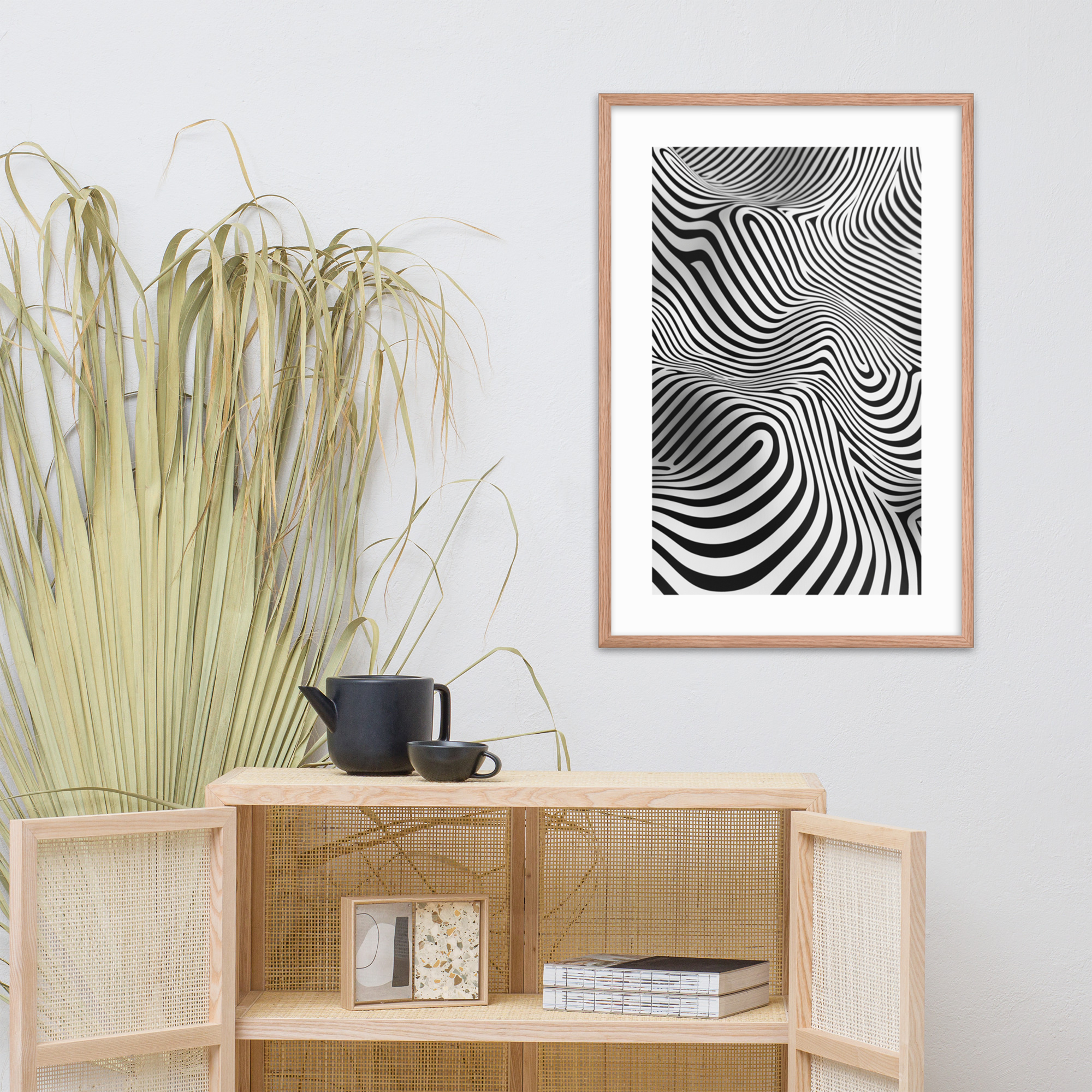
Hallways follow the same logic with a practical constraint: they are viewed from close range and in transit, which means small-pattern or fine-detail prints work better there than in larger rooms where distance reduces detail. A print viewed from four feet in a narrow hallway can carry more compositional complexity than a print seen from twelve feet across a living room. The geometric collection, with its bold but structured compositions, is particularly well suited to hallway placement.
For entryways with limited wall width, a vertical format or a tall narrow print suits the proportions better than a wide horizontal composition. Our 12×18 format, which is taller than it is wide, is the most versatile entryway size across standard residential entryway dimensions.
Outdoor-Adjacent and Transitional Spaces
Sunrooms, screened porches, breakfast nooks, and any room that is adjacent to or visually connected to an outdoor space present a specific opportunity: the landscape and botanical collections bridge the interior and exterior in a way that no other collections do as naturally.
A landscape print in a sunroom extends the visual logic of the outdoor view rather than competing with it. The Blue Forest Dreams and Sunset Serenity Temple prints from our landscape collection both carry the quality of light and quiet that makes an outdoor-adjacent space read as intentionally designed rather than transitional. In a screened porch or sunroom, the Red Oak color story in these prints connects to the natural warm tones of outdoor materials: cedar, teak, rattan, the weathered finish of stone.
For rooms that receive strong direct sunlight, a Black Ink print holds its contrast better than a Red Oak print, which can appear slightly washed out in very bright light. If you are placing a print near a window with consistent direct afternoon sun, the Black Ink color story is the more reliable choice from a longevity and visual consistency standpoint.
Pairing Prints Within a Room
When placing more than one print in the same room, the pairing logic matters as much as the individual print choices. Three rules that produce reliable results:
One color story per wall. A wall with both a Black Ink and a Red Oak print will read as indecisive rather than varied. Use the second color story on a different wall or in a different room. The contrast between the two color stories reads as intentional design when it occurs across space rather than within a single field of view.
Subject contrast, tonal agreement. Two prints in the same tonal register but in different subject families, a geometric paired with a botanical both in Black Ink, or a landscape paired with an architecture print both in Red Oak, create visual variety without tonal conflict. The eye experiences the subject difference as interest rather than confusion.
Scale hierarchy. In a room with two or more prints, there should be a clear primary and secondary relationship. One print is larger or in a more prominent position; the others are smaller or in supporting positions. A room where two prints of identical size compete for the same position on the same wall looks undecided. A room where one print anchors a wall and a second print is smaller and angled differently reads as designed.
For the full guide to collections and how they translate across every context, visit The Complete Guide to Mid-Century Modern Art Prints.