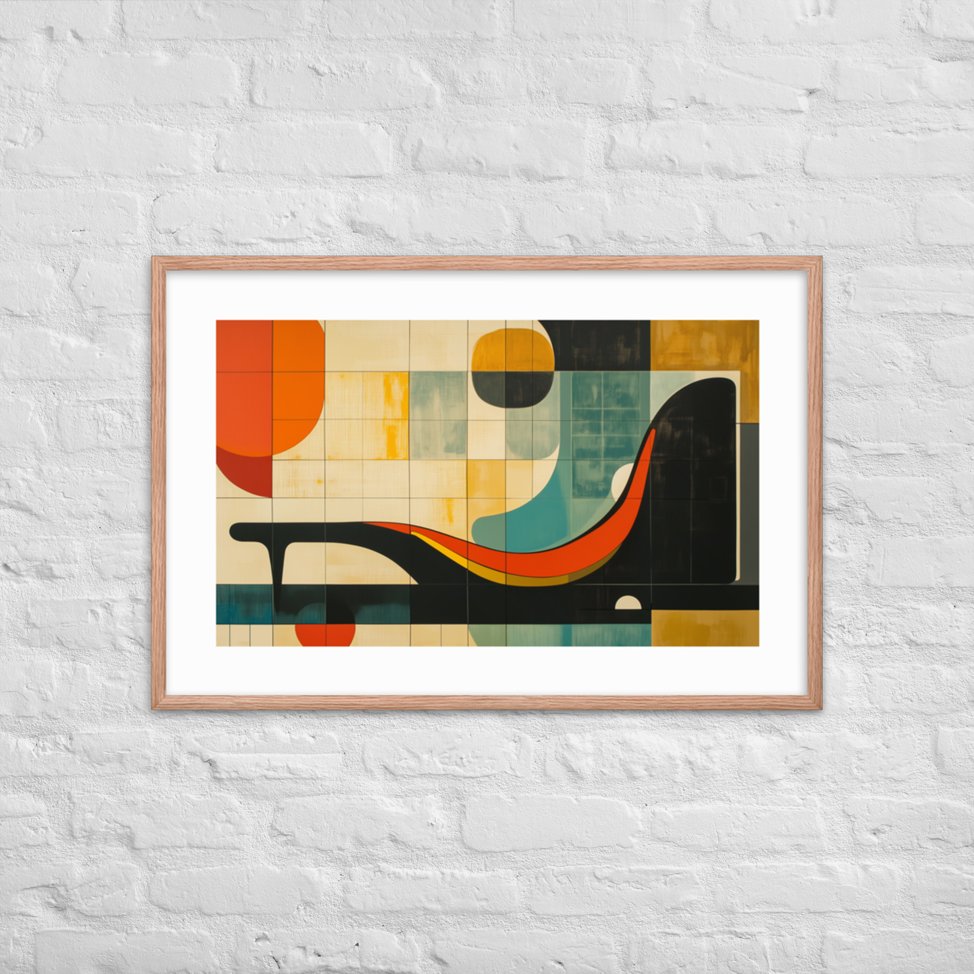
Geometry is the visual language of mid-century modern design. Not decoration applied to a surface, but the underlying structural logic of the era: the starburst exploding outward from a central point, the repeating diamond, the optical pattern that creates depth from a flat plane. If you look at a piece of MCM furniture and ask what makes it unmistakably of its time, the answer is almost always geometry: tapered legs that describe a triangle, a credenza that extends in a clean horizontal band, a Noguchi table where the base traces an organic but precise arc. The same logic appears in the era’s art, and it is exactly what makes geometric art prints the most consistently identifiable category in our catalog. This guide covers what makes geometric prints authentically MCM, the specific motifs our collection draws from, how to choose and size a geometric print for your wall, and how geometric prints pair with other styles in the catalog.
For a broader look at all seven print collections, start with our Complete Guide to Mid-Century Modern Art Prints.
Why Geometry Is the Visual Language of Mid-Century Modern
The mid-century modern era inherited geometry from two earlier movements, the Bauhaus and the International Style, and then did something those movements had not: it made geometry joyful. The Bauhaus grid is disciplined and rational. The mid-century starburst is rational and also playful. It is the same underlying visual logic, but the MCM designers added kinetic energy to it, the sense that the pattern is in motion.
This shift happened partly through new materials and partly through cultural context. Post-war optimism gave designers permission to push beyond the austere geometry of the prewar years. The Atomic Age gave them a specific set of references: split atoms, electron orbitals, Sputnik’s orbit, the starburst shapes of nuclear diagrams. These images were in every magazine and newspaper of the period, and designers absorbed them into the visual vocabulary of everyday objects.
The result is a set of geometric motifs that is specifically, historically mid-century modern: not just any geometry, but the starburst, the amoeba outline, the boomerang, the diamond chain, the optical spiral. These shapes do not appear as prominently in Victorian ornament, or in Art Deco, or in any other period’s design history. They are the signature of this particular era, which is why a geometric print with the right motifs instantly reads as MCM in a way that a simple stripe or grid does not.
Our Geometric and Abstract collection, the largest in the catalog at 10 products, draws directly from this source. Every print in the collection is rooted in an authentic MCM visual vocabulary rather than adapted from a generic geometry trend.
Starbursts, Op Art, and Atomic Motifs: The Era’s Visual Signatures
Within geometric prints, there are several distinct sub-vocabularies, each with its own origin and its own character on the wall.
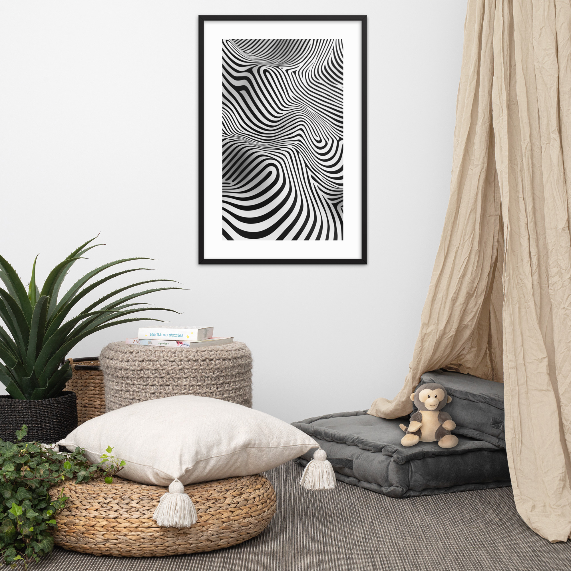
The starburst is the most recognizable MCM motif. Lines radiate outward from a central point in a burst pattern that references the sunburst clock, the Sputnik satellite, and the atomic nucleus simultaneously. A starburst print at large format reads from across a room: it is inherently a statement piece. The starburst is also forgiving of context: it works above a sofa, on a primary bedroom wall, and even in a gallery arrangement as a central anchor.
Galactic Retro Vibes in our collection is the clearest expression of this aesthetic: a bold starburst composition in the Geometric collection’s characteristic saturated palette. In the Black Ink colorway the pattern reads with maximum graphic punch; in Red Oak the same composition takes on a warmer, more amber register.
Op Art sits at the other end of the geometric spectrum. Where a starburst is immediately legible as a specific image, op art compositions play with figure and ground to create patterns that shift as you look at them. Concentric circles, chevron progressions, and interlocking diamonds are the common vehicles. The effect is more intellectually engaging and less immediately decorative than a starburst: op art prints reward sustained attention.
Mid-Century Op Art Mesmerizer is our purest op art piece. The composition creates genuine optical movement from a completely flat printed surface. This is a print best placed where it has room to breathe: above a sofa or on a primary wall rather than crowded into a gallery arrangement where its depth effect gets compressed.
Atomic and molecular motifs occupy the space between pure abstraction and illustrated science. Overlapping circles connected by lines, branching structures that suggest molecular models, the repeating shapes of crystal diagrams: these patterns are immediately legible as a product of the Atomic Age without being literal technical illustrations. They bring an intellectual quality to geometric decoration that the pure abstract shapes do not quite have.
Retro Waves and Amber Geometric Study both draw on this tradition. The wave pattern in Retro Waves references the sinusoidal diagrams of mid-century physics and electronics; the layered geometric planes in Amber Geometric Study create a structural composition that feels designed in the way a piece of MCM furniture feels designed.
Choosing a Geometric Print for Your Wall: Size, Color, and Room Context
The decision to add a geometric print to a room is usually straightforward. The harder decisions are which geometric print, what size, and whether to go Black Ink or Red Oak.
On size: geometric prints scale well. A starburst or op art composition works at 12×18 in a gallery arrangement and at 24×36 as a room anchor, without losing its core visual character. The rule is the same as for any art: the print should occupy 60 to 75 percent of the wall width above the primary furniture. A 24×36 above a standard sofa is usually right. In a bedroom or home office with a smaller wall, 18×24 is the natural choice. For gallery walls, a central 18×24 flanked by smaller prints gives the geometric piece the prominence it deserves as the strongest visual element in the arrangement.
On color: Black Ink geometric prints work best in rooms with cool or neutral palettes and lighter walls. The high contrast sharpens every geometric edge and makes the optical effects of an op art print work at maximum intensity. Red Oak geometric prints warm rooms that already have walnut, teak, or amber tones in the furniture. If your room palette is warm, Red Oak geometric prints integrate more naturally than Black Ink without losing their graphic strength.
On room context: geometric prints are primarily living room and home office prints. The bold visual energy of a starburst or op art composition is better suited to rooms where you want stimulation than to bedrooms where you want calm. In a home office, the graphic confidence of a geometric print communicates something about the space’s identity. In a living room, it anchors the room’s visual logic and sets the aesthetic register for everything else in the space.
Shop the Geometric Collection
Every print in the Geometric and Abstract collection is available in both the Black Ink and Red Oak colorways, in 12×18, 18×24, and 24×36. Here are four starting points from the collection:
Galactic Retro Vibes: the starburst anchor print, best at 24×36 on a primary wall.
Mid-Century Op Art Mesmerizer: the collection’s op art statement piece, most powerful as a single piece on an uncluttered wall.
Retro Waves: a wave-form composition with the rhythmic quality of kinetic art, works well in pairs.
Amber Geometric Study: structural and layered, suited to rooms where the palette skews toward warm earth tones.
Pairing Geometric Prints with Other MCM Art Styles
Geometric prints are the most versatile pairing partners in the catalog precisely because they do not have a subject. A geometric starburst does not have a subject that competes with a botanical composition or a landscape print. It just has form, color, and scale. This makes geometric prints the natural anchor in any multi-print arrangement.
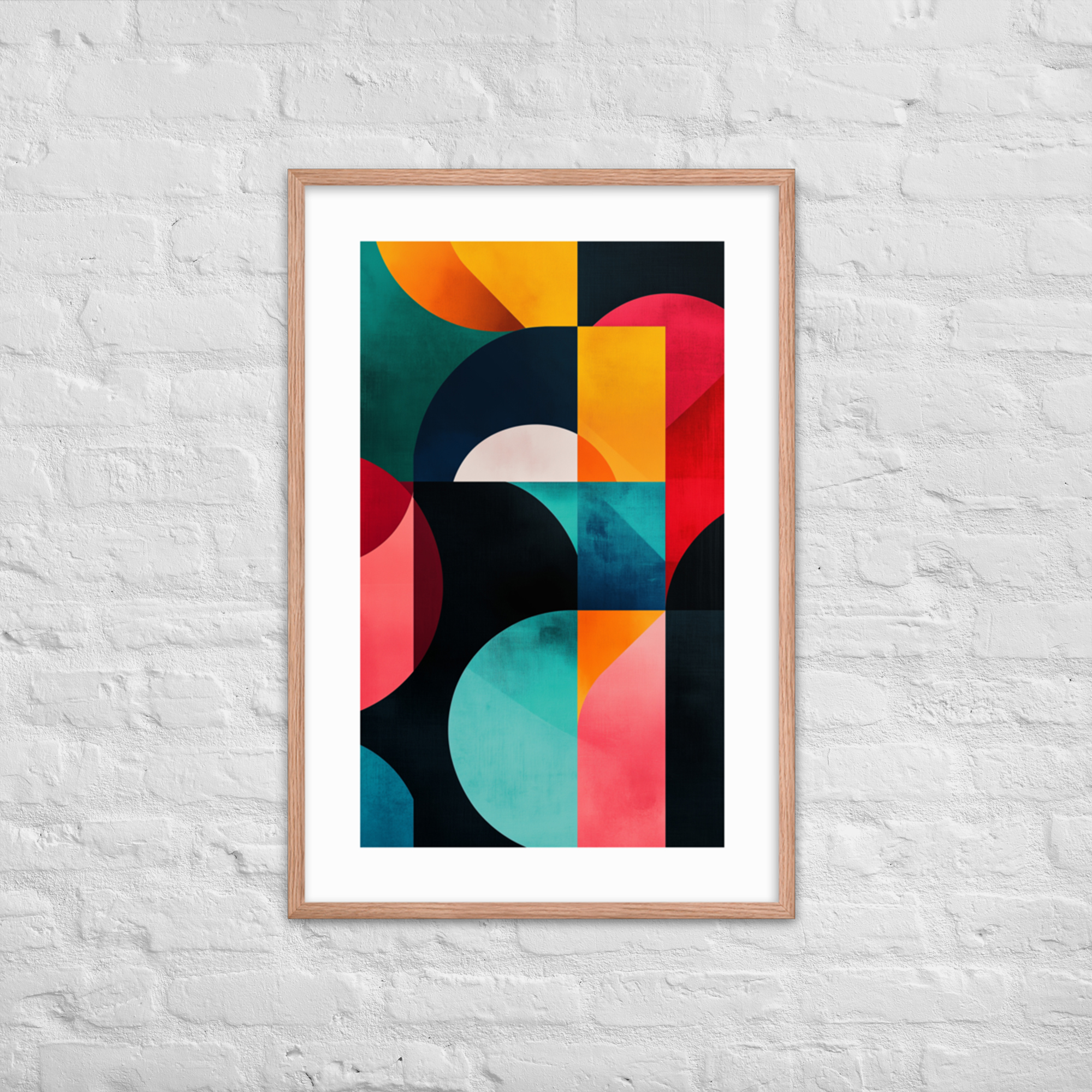
The pairing that works most consistently: a large-format geometric print as the central piece with two smaller prints from a more representational collection, botanicals or landscape, flanking it. The geometric print holds the composition together while the smaller prints introduce variety and natural imagery. This combination covers more of the MCM aesthetic than either type of print could alone: you get the era’s graphic boldness and its connection to the natural world in a single arrangement.
For gallery wall arrangements specifically, see our Gallery Wall Guide for specific layout suggestions and print combinations. For the Space Age and Atomic collections that share the geometric vocabulary, see our Space Age Art Prints Guide.
Browse the full Geometric and Abstract collection in our MCM Art Prints Guide or head to the collection page directly.