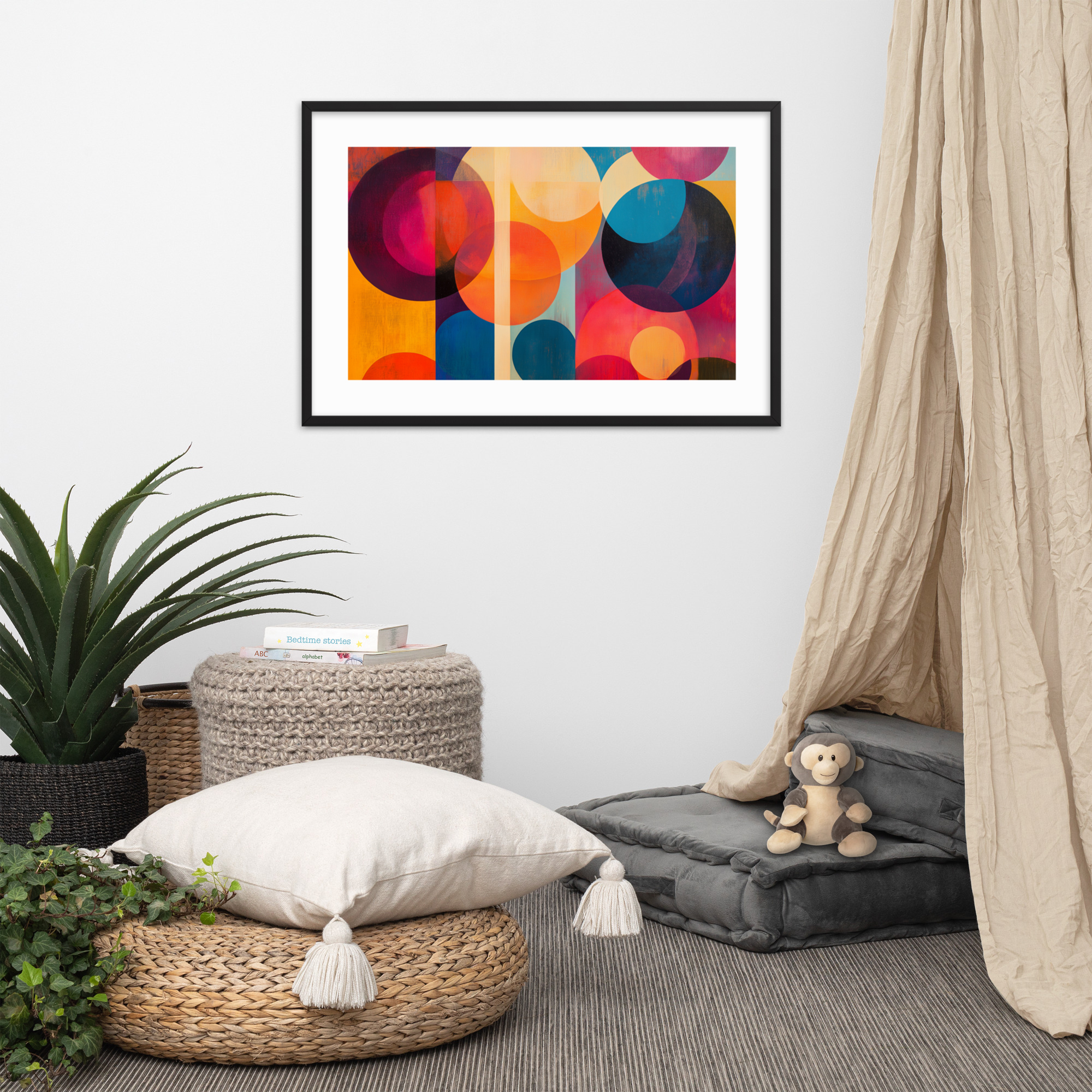
A mid-century modern gallery wall is not an eclectic gallery wall with MCM furniture in the same room. It is a specific approach to wall composition that applies the era’s design principles, structural clarity, intentional restraint, visual coherence within variety, to the problem of displaying multiple prints together. This distinction matters because the eclectic gallery wall, which is the dominant style on Pinterest and in most home decor content, actively contradicts the MCM aesthetic. Eclecticism is the accumulation of things you love. The MCM interior is the curation of things that belong together. These are different activities with different results, and they require different approaches to the gallery wall.
This guide covers the specific characteristics of a MCM gallery wall, the layout principles that work reliably in this aesthetic, how to mix print styles from our catalog without losing coherence, how to scale prints correctly for a gallery arrangement, three specific print combinations from the Mid Mod Style catalog ready to hang as a set, and the framing decisions that make or break a gallery wall in an MCM interior.
For the broader context of art selection in MCM rooms, see our Complete Guide to Mid-Century Modern Art Prints and our Room-by-Room Decorating Guide.
MCM Gallery Walls vs. Eclectic Gallery Walls: The Key Difference
The eclectic gallery wall is defined by variety: different frame colors and styles, prints from different eras and movements, photographs mixed with art, different orientations and aspect ratios filling a wall with visual energy. The result is personal and expressive and says something about the accumulation of a life lived with art.
The MCM gallery wall is defined by coherence within variety. Different prints, yes. Different sizes, possibly. But the same frame style throughout. Prints drawn from the same design era and the same design vocabulary. A visual system that makes the arrangement look designed rather than accumulated. The result is more restrained and more resolved than an eclectic wall, and it requires more prior thought about what goes with what.
The constraint is actually a creative tool. When you know that all frames must match and all prints must come from the same visual era, you make better decisions faster. Instead of asking “what do I love?” you ask “what belongs here, with these other things, in this system?” That is the MCM approach to every design decision, applied to the gallery wall.
The practical implication: before buying any prints for a gallery wall, decide on the frame style and commit to it. In an MCM interior, the most consistent frame choices are walnut or teak wood frames for rooms with warm-toned furniture, and thin black metal frames for rooms with cool-toned or white-dominant palettes. Mixed frames in a gallery wall immediately read as eclectic rather than MCM. The prints can be different; the frames should not be.
Three Layout Principles That Work Every Time
Gallery wall layouts are one of those topics where every design source has its own system. Here are three that work specifically for MCM gallery walls, tested across different wall sizes and print combinations.
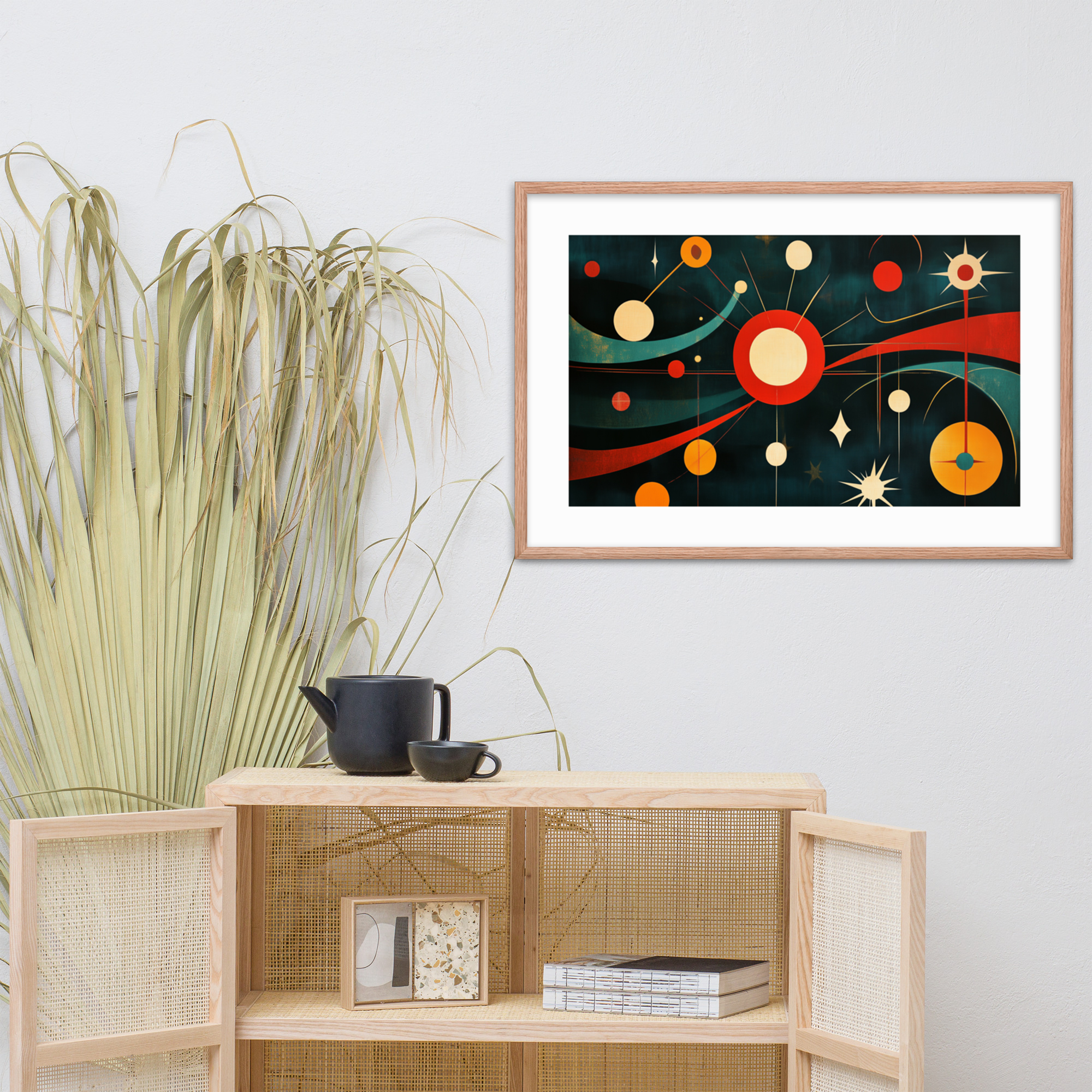
The symmetric grid. A 2×2 or 2×3 arrangement of same-size prints with consistent spacing between them. This is the most disciplined MCM approach: the repetition and precision of the grid applies the era’s structural logic directly to the wall. A 2×2 grid of 18×24 prints, each with 3 inches of spacing between frames, creates a composed rectangular arrangement with total dimensions of roughly 42×54 inches. This works above a sofa, above a console, or on a primary wall in a room where you want the art to feel organized rather than expressive.
The symmetric grid has one vulnerability: it becomes less interesting when all four or six prints are very similar in visual character. Mix a starburst geometric with a botanical, or a portrait with an abstract, to maintain visual interest within the structural constraint.
The centered anchor. A single large print, 24×36 or two 18×24 prints side by side, as the center of the arrangement, with smaller prints, 12×18, flanking it symmetrically on either side. The large center piece establishes the arrangement’s visual anchor; the smaller pieces provide scale contrast and expand the arrangement’s footprint without competing with the anchor. This layout is particularly useful for walls above wide furniture pieces where a single print would be undersized.
The three-print version of this layout, one 24×36 flanked by two 12×18 prints at the same vertical center point, is the most reliable gallery wall format for a first arrangement. The proportions are correct at almost any scale and the visual logic is immediately clear to any viewer.
The vertical stack. Two or three prints in a vertical column, usually same-width but varying in height. This layout works in narrow wall sections, beside doorways, or in hallways where horizontal span is limited. A vertical stack of one 18×24 above one 12×18 is the right scale for most hallway walls. The vertical stack has no lower size limit: two 12×18 prints in a column work in a space as narrow as 16 inches.
Mixing Print Styles Without Losing Cohesion
The question of which print styles can coexist in an MCM gallery wall has a principle behind it: prints that share the same design vocabulary can coexist; prints that come from different design vocabularies create visual friction.
The MCM vocabulary includes geometric and abstract, botanical and natural, pop art and portrait, space age and atomic imagery. All of these belong to the same design era and reference the same underlying aesthetic logic. A starburst print and a botanical print come from different subject domains but from the same design moment: they speak the same visual language. A starburst print and a contemporary photograph of a city street do not.
In practice, the most successful MCM gallery wall combinations tend to work across two subject domains with consistent visual character. Geometric plus botanical is perhaps the most common and reliable: the structural clarity of the geometric prints and the organic form of the botanical prints create a visual dialogue that is more interesting than either alone. Pop art plus architecture is another coherent pairing: both are interested in the built and designed human world, represented with graphic precision.
The combinations to avoid: prints from radically different eras of design, prints with very different scale of detail (a highly detailed illustrative piece alongside a bold minimalist composition creates visual imbalance), and more than three different subject types in a single arrangement (beyond three, the wall starts to read as eclectic rather than designed).
Size and Spacing: Getting the Scale Right
Gallery wall sizing has two variables: the size of the individual prints and the size of the total arrangement. Both need to be right for the wall to work.
For the total arrangement, apply the same 60-75 percent rule as for individual prints: the arrangement’s total width should be 60 to 75 percent of the furniture width below it. An 84-inch sofa wants a gallery arrangement between 50 and 63 inches wide. A 36-inch console wants an arrangement between 22 and 27 inches wide.
For individual print sizes within the arrangement, consistency is more important than correctness. A grid of 18×24 prints looks organized and intentional even if the individual prints would be too small for that wall on their own. The arrangement as a whole achieves the scale; the individual prints do not need to do it independently.
Spacing between frames in a gallery wall should be consistent within the arrangement: 2 to 3 inches between frames is a standard that reads as designed. Less than 2 inches makes prints feel crowded; more than 4 inches makes the arrangement look like a loose collection rather than a composed gallery wall. For the vertical and horizontal distances to be equal (which they should be in a grid layout), measure from frame edge to frame edge, not from print edge to print edge.
For detailed sizing guidance by room and wall type, read our Art Print Size Guide.
Three Ready-to-Hang Gallery Wall Combinations from Mid Mod Style
These three combinations are designed as complete gallery walls, using prints available in the catalog now. Each is specified with print sizes and a layout format.
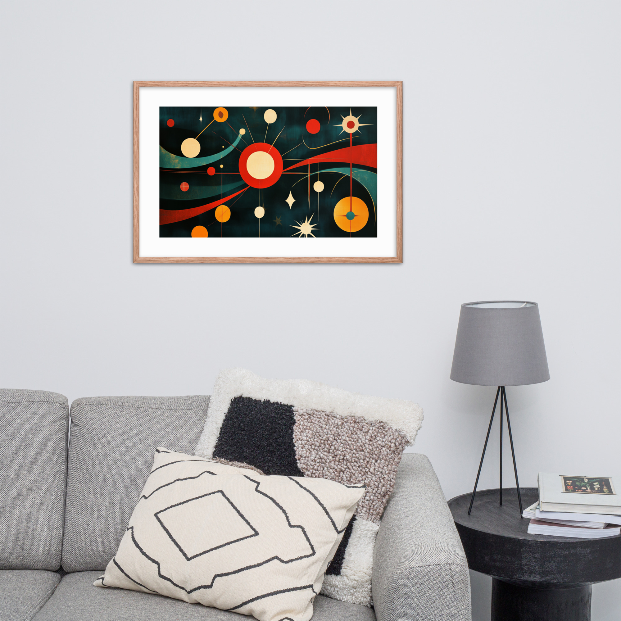
Combination 1: The Geometric and Atomic Grid
Layout: 2×2 symmetric grid, all 18×24, matching thin black frames, 2.5 inches between frames.
Prints: Galactic Retro Vibes (18×24, Black Ink), Mid-Century Op Art Mesmerizer (18×24, Black Ink), plus two additional prints from the Geometric collection.
Best room: Living room above a 72-inch or shorter sofa, or on a home office wall opposite the desk.
Combination 2: The Botanical and Nature Anchor
Layout: Centered anchor with one 24×36 flanked by two 12×18, all aligned at vertical center.
Prints: Vivid Tree of Life (24×36, Red Oak) as center anchor, plus two botanical or landscape prints at 12×18.
Best room: Dining room or sunroom where the natural imagery works with the room’s organic orientation. Red Oak colorway throughout for consistency.
Combination 3: The Portraits and Geometry Mix
Layout: Three-print horizontal row, 18×24 each, consistent spacing.
Prints: Lady in Technicolor (18×24, Black Ink), a geometric print from the Geometric collection, and a second portrait from the Pop Art collection.
Best room: Entry hall or living room secondary wall. The human presence of the portrait prints anchors a room without dominating it.
Framing: Matching Frames Across a Gallery Wall
Frame consistency is the single most important decision in an MCM gallery wall, more important than which prints you choose. The right prints in mismatched frames look like an eclectic collection. The same prints in matched frames look designed.
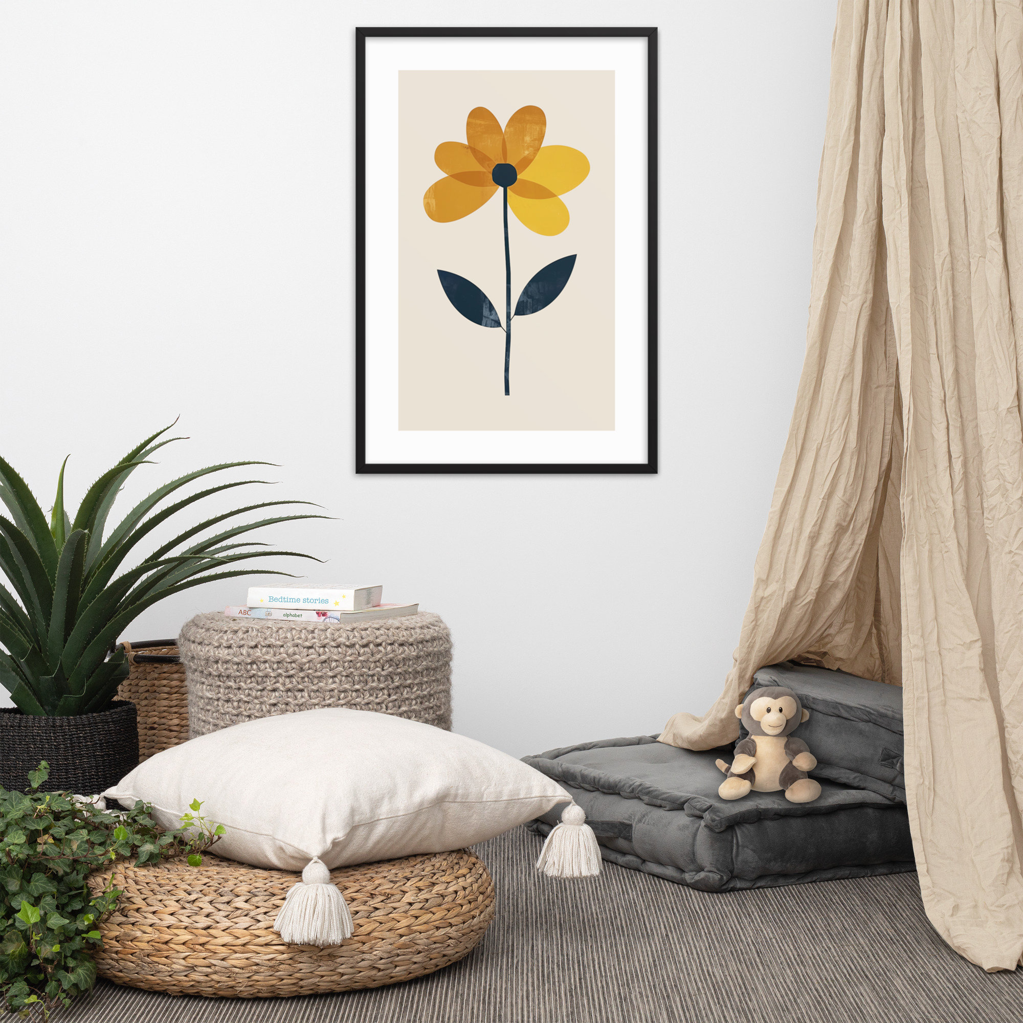
The two frame styles that are most consistent with MCM design are:
Thin metal frames in black or brushed brass. These are the most neutral framing choice in an MCM context: the frame’s thinness keeps attention on the print rather than the boundary between print and wall, and the metal material belongs to the era’s aesthetic in a way that a thick wood frame does not. A 1-inch thin black metal frame works with every print in the catalog.
Solid wood frames in walnut or teak. These are the warmer option and suit rooms with warm-toned furniture better than thin metal frames. The connection between the frame’s wood tone and the furniture’s wood tone creates visual coherence throughout the room. This frame style works best with the Red Oak colorway prints, which already have warmth built into their palette.
For more guidance on framing choices in the MCM context, read our Framing Guide. Browse the full print catalog for gallery wall combinations at the Geometric, Botanicals, and Pop Art collection pages.