Pop art and mid-century modern share more than a time period. They share a design philosophy: that everyday life, American culture, consumer objects, and human faces belong in art with the same seriousness that traditional fine art gave to religious subjects and landscape. Pop art declared that a Campbell’s soup can was as worthy a subject as a historical battle. MCM design declared that a molded plywood chair was as worthy a design object as a museum piece. Both movements were saying the same thing from different starting points: the line between art and life is arbitrary, and the right response to that is to erase it.
Our Pop Art and Portraits collection draws from this convergence. The 8 products in the collection include bold portrait prints that bring human presence into the MCM interior, figure compositions that use the era’s saturated palette in ways that feel unmistakably of their moment, and color-field work that sits at the boundary between pop art and abstract expressionism. This guide covers the connection between pop art and MCM, why portrait prints work in the mid-century modern home, how to choose and place a pop art print, and which pieces from the collection work best in specific room contexts.
For context on all seven collections, start with our Complete Guide to Mid-Century Modern Art Prints.
Pop Art and Mid-Century Modern: Two Movements, One Visual Language
Pop art emerged in the late 1950s and hit its stride in the 1960s, exactly when mid-century modern design was reaching its peak commercial and cultural moment. These were not separate developments that happened to overlap. They were expressions of the same cultural shift: the post-war era’s reassessment of what counted as art, what counted as design, and what belonged on the walls of a home.
The visual overlaps are significant. Both pop art and MCM design favor strong, clear outlines over the gestural ambiguity of abstract expressionism. Both use saturated, high-key color in ways that feel energetic rather than somber. Both reference popular culture, commercial imagery, and mass production not as something to transcend but as something to celebrate. And both emerged from a culture that had just survived a war and was ready to find beauty in the ordinary world it had fought to protect.
The specific techniques also overlap. Silkscreen printing, which Warhol used to create his celebrity portraits and consumer-object icons, produces exactly the kind of flat, high-contrast color fields that also appear in MCM graphic design and textile work. The repeatability of the technique, the way a single image can be reproduced across a series, is something MCM designers also embraced: you could buy a good design as well as inherit one, and that access was part of the point.
What this means for decorating is that pop art prints and MCM design are not competing aesthetics that must be balanced carefully. They are cousins from the same cultural moment. A pop art portrait print on the wall of an MCM living room is not an eclectic juxtaposition; it is a historically coherent choice.
Portraits and Figures in the MCM Home: Why They Work
Portrait art serves a function in the home that abstract and geometric prints cannot: it brings human presence into the room. The eye instinctively finds faces in its environment, and a well-chosen portrait print gives the eye something to return to in a room where the furniture, however well designed, is all object and no person.
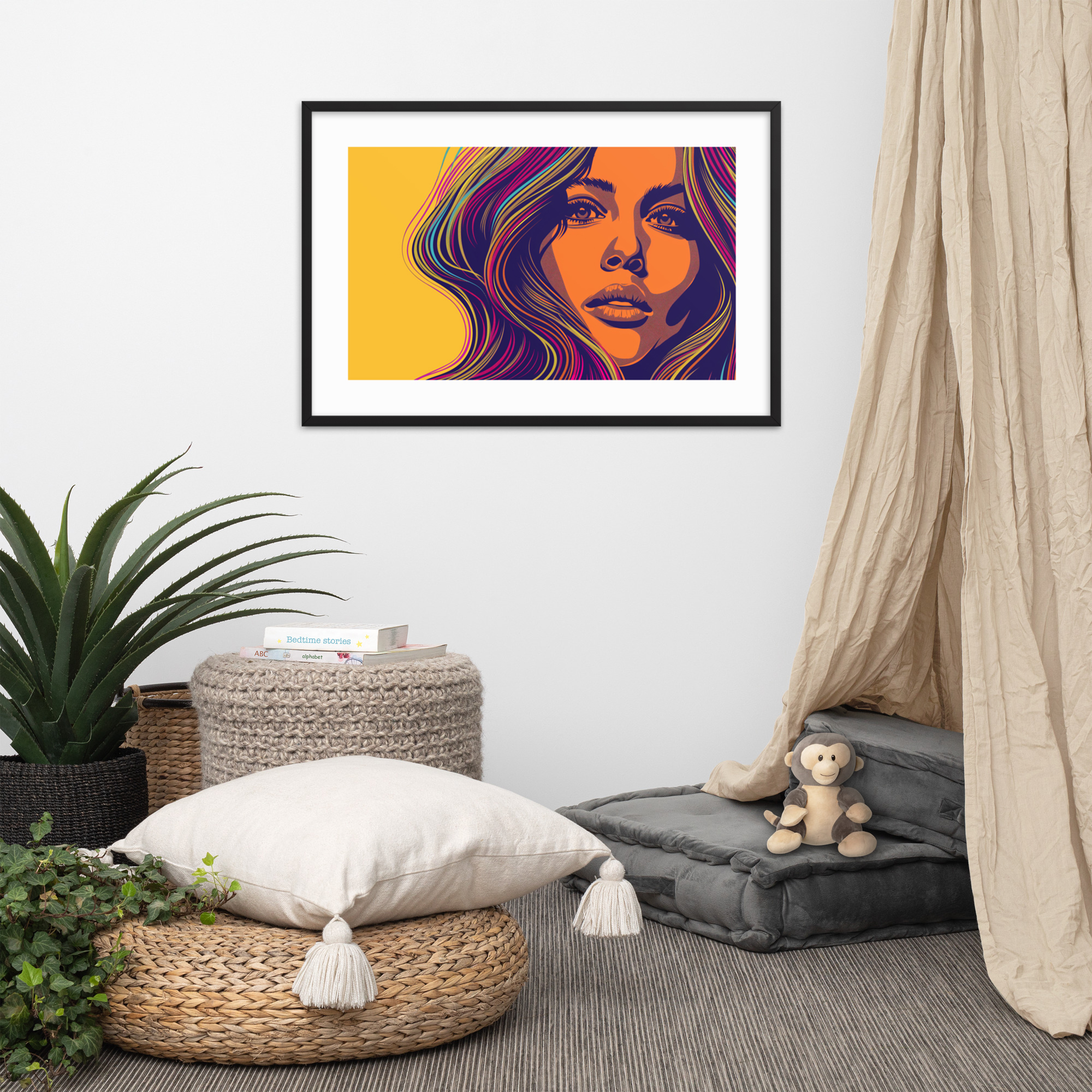
This human presence works differently from the family photographs most people display. Family photographs are documents of specific people and specific moments. A portrait print from our Pop Art collection is a representation of a type, an archetype of glamour, attention, or style that belongs to the era without being tied to anyone specific. Lady in Technicolor is a figure who exists in the MCM cultural imagination, not a specific woman. The print brings femininity, color, and presence into the room in a way that is more aesthetically resolved than a documentary photograph of a real person.
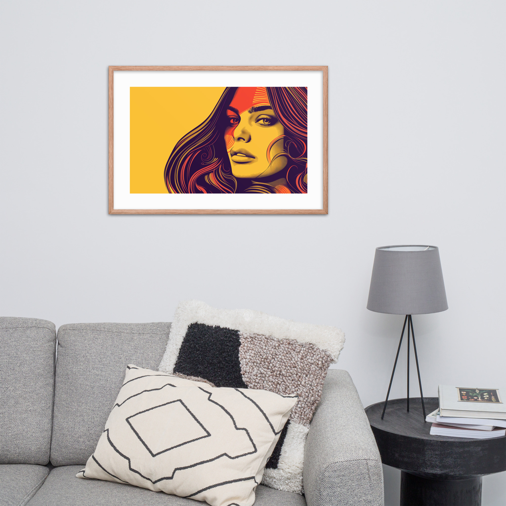
Golden Hour Gaze works in a similar register: a figure caught in warm light, rendered with the pop art approach to color that pushes saturation beyond naturalism. The result is a print that reads as both portrait and color study simultaneously.
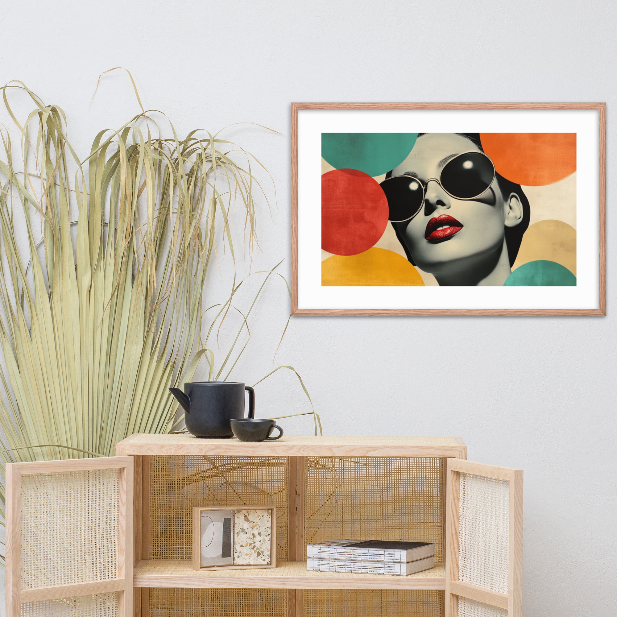
Sunset Starlet brings the same MCM-pop vernacular to a more directly glamorous composition: warm-toned, high-contrast, the kind of image that references the celebrity culture that pop art took as its subject matter without being about any specific celebrity. This is a print for rooms where you want art that feels culturally alive rather than historically frozen.
For buyers who want a portrait with stronger graphic energy and less figural naturalism, Pop Luxe Portrait pushes toward the abstract end of the pop art spectrum: a composition where the portrait elements are present but mediated through color fields and graphic treatment. This is the collection’s most versatile portrait for rooms that are more geometrically oriented but want to introduce a human element.
Bold Color Meets Clean Composition: What to Look For in a Pop Art Print
Not all pop art prints are created equal for use in a mid-century modern interior. The key is finding prints where the MCM design principles, clean composition, structural clarity, and purposeful color, are applied to pop art subject matter rather than prints where pop art’s expressive impulses override those principles.
The prints to look for share certain characteristics: a clearly organized composition with identifiable structure, saturated color that is applied with intention rather than energy alone, and subject matter that connects to the pop art tradition without referencing contemporary culture in ways that will date. A print that captures the visual language of 1960s celebrity culture does not go stale the way a print that references a specific current celebrity does.
Scale matters in pop art prints more than in most other categories. Pop art was often made large: Warhol’s celebrity prints were typically produced at dimensions that made the image take over the wall. A small pop art print in a large room loses the commanding presence that is part of the aesthetic’s meaning. The 24×36 is the right starting size for any pop art print placed as a primary piece on a significant wall.
Where to Hang a Pop Art Print: Living Room, Entry, and Study
Pop art prints are extrovert art. They do not belong in the bedroom or in other rooms where the register should be quiet and restorative. They belong in rooms that are made for social life, for arrival and impression, for the kind of alert engagement that comes from being with other people or from productive work.
The living room is the primary location. A portrait print above or beside a sofa turns the sofa area into a corner with personality rather than just a seating arrangement. The human presence in the portrait gives visitors something to talk about and gives the room a center of gravity that purely abstract art does not provide. See our Living Room Art Guide for sizing guidance on the wall above the sofa.
The entry hall is an underused location for art in most homes, and it is one of the best locations for a pop art portrait. The first thing you see when you enter a home sets the register for everything that follows. A bold portrait print in the entry says that this is a house where art matters and where visual culture is part of daily life. At 18×24, a portrait print in an entry hall is large enough to make a statement without overwhelming a typically narrow space.
The study or home office benefits from bold, graphic art that signals focus and identity without being the distracting visual complexity of an op art composition. A pop art portrait in a study, particularly a portrait with a composed, forward-facing energy, sets a productive register for the room. For more on art choices in the home office context, see our Gallery Wall Guide for ideas on integrating pop art prints into larger arrangements.
Shop the Pop Art and Portraits Collection
The full Pop Art and Portraits collection is available in both Black Ink and Red Oak colorways, in all three sizes. The Black Ink colorway gives pop art portraits maximum graphic intensity; Red Oak warms the same compositions and makes them feel slightly more organic. Both work for portrait prints, but for the collection’s boldest pieces, Black Ink tends to preserve the pop art sensibility more directly.
Lady in Technicolor: the collection’s most vibrant portrait composition. The combination of saturated palette and confident composition makes this a statement piece for any primary wall.
Golden Hour Gaze: warm-toned figure composition with pop art color sensibility. Works particularly well as a secondary piece in a gallery arrangement anchored by a geometric print.
Sunset Starlet: the collection’s most directly glamorous piece. Best at 24×36 on a wall that can hold the composition’s energy.
Pop Luxe Portrait: the most abstract portrait in the collection. Bridges the gap between pop art and geometric work, making it a versatile choice for rooms with a stronger geometric orientation.
Browse the full catalog at our MCM Art Prints Guide.